Also used for the Mastertronic M.A.D. Flash Gordon cover - Ming the Merciless’ head (on my phone so cant attach the image)


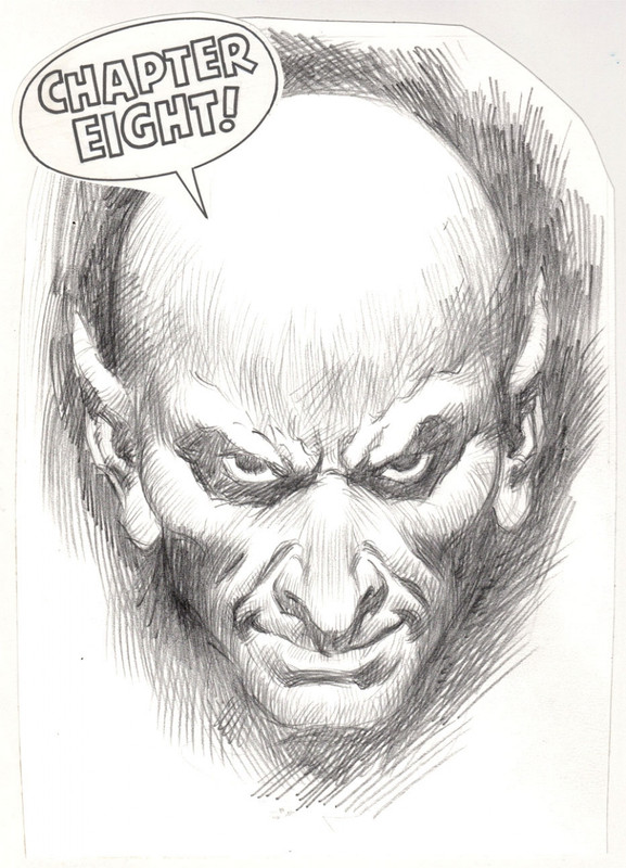
Looks like it’s the same artist doing both covers
Also used for the Mastertronic M.A.D. Flash Gordon cover - Ming the Merciless’ head (on my phone so cant attach the image)
It looks like it was based on the cover of Piece of Mind (1983).Juan F. Ramirez wrote: ↑Sun Feb 17, 2019 1:51 pm Not artwork, but this loading screen of "Chambers of Horrors” by Omega Software reminds me of certain character used by a great rock band in their covers back in the 80s...


I've obly seen that logo in these CRL horror text adventure series (Dracula, Frankenstein, Wolfman and another one IIRC).
In December 1986, the first computer game to be certified by the BBFC was an illustrated text adventure called Dracula, based on the Bram Stoker novel, published by CRL, the game received a 15 certificate. The first computer game to receive an 18 certificate, on 11 December 1987, was another illustrated text adventure called Jack the Ripper, also by CRL, which dealt with the infamous real life murders in Victorian London. The horror in both games came through largely in their detailed prose. Had the game publishers reprinted the games' text in book form, it would not have carried a certificate, as the BBFC has no oversight over print media. Both games had numerous certificate stickers all over their covers to emphasise to parents and retailers that they were not intended for children, as computer games carrying BBFC certificates were previously unheard of.
CRL wanted them certified for the publicity.Juan F. Ramirez wrote: ↑Mon Jun 10, 2019 6:09 am Was is something imposed by the industry (something like the current PEGI) or by the company itself?


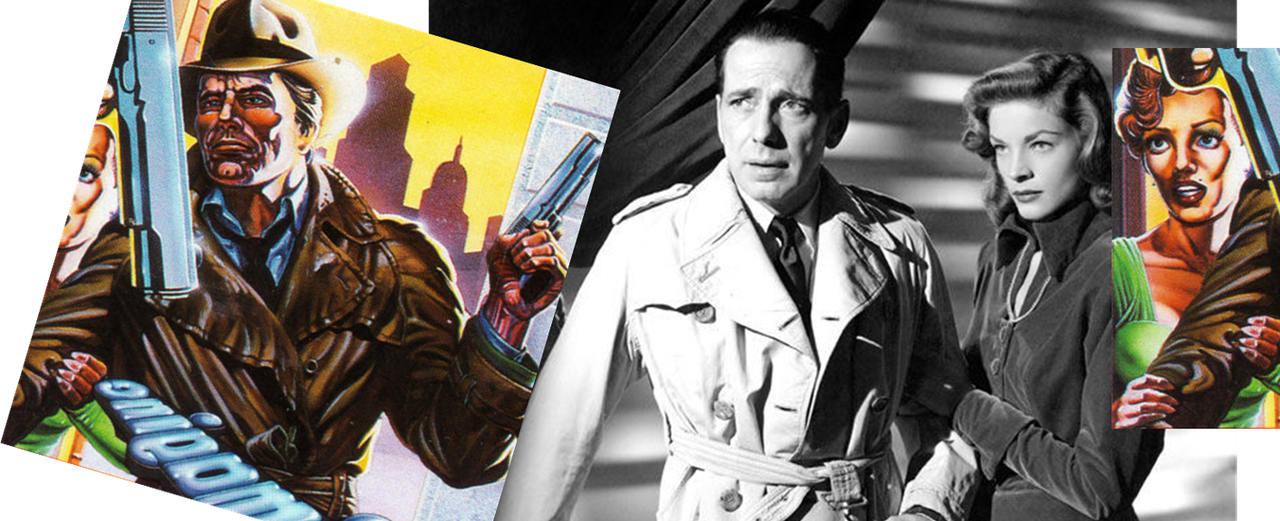
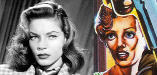
I think we've been here before.Ersh wrote: ↑Sun Dec 01, 2019 3:04 pm Dark Passage is one of my all time favourite movies.
Direct copy, minor differences? I'm sorry, I just don't see it. I may not be the greatest artist but I feel I'm at least somewhat competent in seeing references and I can't find any similarities between the photo of Bogart and the detective, sans wearing similar clothes. The angle of the body is wrong, there are no matches in the folds of the fabric, the lapel is totally different, they don't even share the same lighting. Any old '40s reference photo may've been used, if any.

Certainly that's the opinion of Michael Gonzales:
https://crimereads.com/the-groundbreaki ... -steranko/"For a moment I just stared at him, as the man himself flashed me one of his trademark Kodak smiles. With his jet black perfect hair, G.Q. wardrobe, sunglasses and spit-shined boots, he was iceberg smooth. “How you doing over there,” Steranko said in his world’s greatest showman voice. I shyly glanced at him and back at the Chandler cover when I suddenly realized that the picture of that mean streets private dick was actually a self-portrait."