
So... I'm working on a proportional font thing. I wondered how anyone else encoded theirs.
I've made a character designer that's working well for "fixed width" characters, and I'm ready to implement the next part.
Rather than a look up take it widths I think I'll use 7 bytes for the character (7 high by 8 pixels wide) but the first byte I'll devote to width (the lowest 3 bits, giving me a width of that number +1).
I'm also going to use bit 7 as a flag to say that the character should be printed 2 pixels lower than normal (so I can do my "descenders" (g, y, j, p, q).
Not sure what else I might need, and whether I can think of a use for the other four bits for each character. (I'm considering whether I could use them for tighter kerning, some superscript characters, out something else entirely).
Proportional Font Routines
Proportional Font Routines
CLEAR 23855

-
Ast A. Moore

- Rick Dangerous
- Posts: 2641
- Joined: Mon Nov 13, 2017 3:16 pm
Re: Proportional Font Routines
There are numerous approaches, depending on your end goal. Universality will obviously impact speed and size, whereas optimizing for speed will limit what you can do with your proportional font printing routine.
Feel free to browse this thread on WoS I created (I posted several older versions of my proportional-width printing routine there). Sorry, some pictures are offline (because TinyPic went tits up).
The most recent implementation of it could be found in this little tutorial I made for the 2018 issues of the WOOT! magazine. The tutorial covers a slightly different topic, but it’s implemented using a more advanced version of the routine above.
Every man should plant a tree, build a house, and write a ZX Spectrum game.
Author of A Yankee in Iraq, a 50 fps shoot-’em-up—the first game to utilize the floating bus on the +2A/+3,
and zasm Z80 Assembler syntax highlighter.
Author of A Yankee in Iraq, a 50 fps shoot-’em-up—the first game to utilize the floating bus on the +2A/+3,
and zasm Z80 Assembler syntax highlighter.
Re: Proportional Font Routines
Thanks for those links/info.
Difficult to know exactly what my endgame is at this point. When I made my 6 pixel fixed width font/routines a few years ago, and made it into a BASIC friendly stream printing thing (
Here ) I was considering a pretty "flip book" thing. That I roughly implemented here: ( see )
With this new routine, I've completely started again with it (hopefully I now have more assembly skills, so it should be written slight better) but I'm actually not sure what I'm considering for it other than I was writing write a font editor anyway, so I could choose how my data was stored. (My intention is storing the font rotated through 90 degrees, to speed up a scroller I'm working on ... and I see in linked threads that that isn't a unique thought!). I will still do that, but whilst working on the font editor I thought I'd make a version for proportional printing too. Just to make something pretty, I think.
That ZXF stuff is far more flexible than I'm planning. And yes, I know I'm miles behind that!
CLEAR 23855

Re: Proportional Font Routines
Have a look at the Adobe BDF file format to get an impression how data is stored there:
https://www.adobe.com/content/dam/Adobe ... F_Spec.pdf
It is a format that is much more advanced than what is typically need on a Speccy, but some of its principles can be useful to keep in mind:
• storing font height as a global value
• storing the glyph as a trimmed bitmap image
• storing advance width as a value per glyph (for proportional fonts)
• storing (x,y) placement of the glyph on the advance width
Re: Proportional Font Routines
Thanks, some interesting ideas there.
I'm thinking I might stick with just 8 bytes of data for each character. 7 for graphics, one data byte.
The dates byte might either be:
width (or rather how far on the cursor position moves)
(Using 4 bits - 0-9 being normal values)
Then the other bits being '+/-' in the vertical direction flag, and
That could be used for super/subscript characters (allowing for the asterisk, apostrophe and quote marks to be raised, and my hanging descenders on lowercase g,y,etc).
This means the '0' width could be used for accents, in a superscript position. Meaning ê would be encoded as the circumflex accent character, which would print the accent, but not move the print position followed by a regular e.
I'm sure that might be useful!
My other idea for the use of the data byte is for width, and four flag bits. They'd be whether the character has a 'gap' at the top / bottom on the left and right.
My thinking here would be that a lowercase letter like 'o' probably has a gap above it (both left and right) and an upper case 'T' has a gap below it on the left and right.
Thus by checking the data byte of a character I'm printing, if they have "interlocking" gaps (top left/ bottom right) then the character can be kerned one pixel closer.
Eg. the word "Too" would put the "o" slightly closer to the "T".
Not sure which approach I'll find more useful/fun.
Will probably end up doing both. I know what I'm like.
CLEAR 23855
Re: Proportional Font Routines
Consider that some glyphs might need to occupy full height (from ascender to descender height). For example vertical bar.
Would that still be possible?
Could be useful indeed. In modern fonts this principle exists (they are called combining accents).This means the '0' width could be used for accents, in a superscript position. Meaning ê would be encoded as the circumflex accent character, which would print the accent, but not move the print position followed by a regular e.
I'm sure that might be useful!
Consider how this might work with narrow base glyphs such as î versus wider base glyphs such as ô.
Re: Proportional Font Routines
I'm glad I post here. Definite food for thought.
There vertical bar I would sacrifice as "full height" and, if needed, make a superscript top-half character and siubscript bottom-half that could be combined. This could be done at the print parser, if needed.
Hadn't thought of the accented lowercae 'i' of one pixel width. The implication of the accent on that letter would be to shift it rightward, and make its apparent width greater. I'll have to give that some to thought as to whether it'd be worth while to encode that, or at the parser end turn it into a string such as "accent, space, i, space"
CLEAR 23855
Re: Proportional Font Routines
Happy to help! 
RE vertical bar: that was the quickest example I could think of.
There are other glyphs that in some designs might be full height, such as an elegant tailed f in script style.
Or block graphics for creating borders.
I am sure there are workarounds but keep in mind that it can be limiting for other people who might want to create fonts for this format.
-
Ast A. Moore
- Rick Dangerous
- Posts: 2641
- Joined: Mon Nov 13, 2017 3:16 pm
Re: Proportional Font Routines
I, too, played around with the idea of adding fancy automatic features to my routine. I even went as far as creating a few special glyphs for the most common ligatures and, as an alternative, programmed in a few special kerning cases for the most common ligatures, such as “fl,” “ffl,” “fi,” etc. However, I (mostly) abandoned the idea and went with manual kerning. The routine allows you to specify—via a series of simple “control codes”—the amount by which to kern any adjacent characters manually.
It would be impractical to design or even pre-program any sensible number of pre-kerned pairs. Modern-day fonts can easily afford to have as many as dozens or even hundreds of pre-kerned, pre-hinted pairs embedded in them. Then again, what’s a few kilobytes between friends nowadays?
Take a pair of letters such as “AW.” Clearly, it’s easier (and much, much faster) to kern them and control the overlap manually, rather than letting the routine decide that.
Every man should plant a tree, build a house, and write a ZX Spectrum game.
Author of A Yankee in Iraq, a 50 fps shoot-’em-up—the first game to utilize the floating bus on the +2A/+3,
and zasm Z80 Assembler syntax highlighter.
Author of A Yankee in Iraq, a 50 fps shoot-’em-up—the first game to utilize the floating bus on the +2A/+3,
and zasm Z80 Assembler syntax highlighter.
Re: Proportional Font Routines
I can see the manual kerning route being sensible, actually. Then that asks different questions I suppose of how the text data is stored. If it's uncompressed there's a free 'bit' on each character to flag that it needs 'tucking in' one pixel (most common?). Then ctrl codes for anything less common (2 pixel, bigger gaps, etc).
I quite like that approach.
I quite like that approach.
CLEAR 23855
-
Ast A. Moore
- Rick Dangerous
- Posts: 2641
- Joined: Mon Nov 13, 2017 3:16 pm
Re: Proportional Font Routines
Here’s an actual example of from the tutorial:
Here, control code 1 means and indent (a preset value), $D means new line (the routine can automatically break words and create a new line, making sure it doesn’t cut a character midway, but the results are not rarely perfect), and 2 indicates kerning. What follows the 2 is the actual number of pixels to kern the next character left (negative values) or right (positive values). Zero is the end-of-string marker for the pinter routine.
Another control code (not shown in this example) is the text color. I normally only use it at the beginning of each paragraph, because of the color clash. However, if you carefully place your text, you can highlight different sections of it with different colors.
So, four control codes altogether. Adding more is not difficult but would impose extra overhead on processing each character of text in a string.
Code: Select all
	defm 1,"The CALL instruction places the address of the first char-",$d
	defm "acter of the string onto the stack, and our printer routine",$d
	defm "can simpl",2,-1,"y POP it from there.",0
Another control code (not shown in this example) is the text color. I normally only use it at the beginning of each paragraph, because of the color clash. However, if you carefully place your text, you can highlight different sections of it with different colors.
So, four control codes altogether. Adding more is not difficult but would impose extra overhead on processing each character of text in a string.
Every man should plant a tree, build a house, and write a ZX Spectrum game.
Author of A Yankee in Iraq, a 50 fps shoot-’em-up—the first game to utilize the floating bus on the +2A/+3,
and zasm Z80 Assembler syntax highlighter.
Author of A Yankee in Iraq, a 50 fps shoot-’em-up—the first game to utilize the floating bus on the +2A/+3,
and zasm Z80 Assembler syntax highlighter.
Re: Proportional Font Routines
Well, this is the fixed width version of my editor, that is now pretty well featured I think.
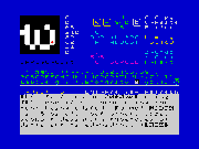
Tap file
QAOP + M/Space to set pixels
W,S,9,0 to choose character (or N, to progress to the 'Next')
5,6,7,8 scrolls the screen
x clear editor
z revert to when you entered the character (undo)
c/v copy and paste
ENTER - two pages of preview text, in your font. 'e' edits the preview text on one of the screens.
T - changes the fixed width. This preview display uses 9 pixels per row, (which you can't alter, without a poke or two).
The font is stored at 61440. Exit to BASIC and SAVE "font" CODE 61440,768 if that's your thing (or just dump the memory from 61440)
I'm pleased with how this works. Simple, but quick and usable.
CLEAR 23855
Re: Proportional Font Routines/editors!
Progress on this (which is all just a side project of me trying to make a new font for me ATTRibute graphics scroller).
I've now done two versions of the font editor:
1. A 'normal' font editor for editing 8x8 fixed width characters.
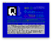
Fixed Width Editor TAP file
2. A proportional font editor for editing 7x8 characters. The first byte of each character to store both the width and the +/- offset in the vertical direction for that letter. This means apostrophes can sit 'high', and commas (and letters with 'danglers') can be low (and it's quite possible to have fonts with a effective height of 9 or 10 pixels, all stored in the usual 768 bytes.
Proportional Font Editor TAP file
Both there editors have now the following new commands:
R - 'rotate' letters (Rotating proportional 7x8 characters corrupts the data byte, but it's easy enough to K/L U/D to correct it)
CAPS+R - rotate ALL letters
F - flip a letter horizontally
CAPS+C - copies the system font to 61440 be edited by the user
Plus other keys:
Q,A,O,P with M/Space to toggle pixels
W,S,9,0 to choose the character you're editing (or N, to progress to the 'Next') - note there is no 'store' button. If you change it ... you change it!
5,6,7,8 scrolls the screen (left,down,up,right)
X clear current character
Z revert to when you first selected the character you're editing (a kind of brutal undo, to account for the lack of 'store')
C/V copy and paste (the copy paste buffer is shown)
ENTER - toggles two pages of preview text, in your font. This text isn't updated automatically in the new font, so press 'Enter' to check how it's looking.
CAPS+Q - exit to basic
E - edit the preview text
T - changes the fixed width of the fixed font *(only in the fixed font editor)
T - changes the fixed height (linespacing) of the font, in the preview window *(only in the proportional font editor)
These keys are exclusive to the proportional font editor
K/L - change the width of individual characters on the proportional font editor
U/D - changes the vertical offset up/down of individual characters on the proportional font editor
Most of the keys are shown on the screen.
The edited font is stored at 61440. Exit to BASIC and SAVE "font" CODE 61440,768 (or dump the memory from 61440)
M/c resides at 32768
At some point I'll bundle them together with some fonts on a TXZ file, and a BASIC loader and routine to saving/loading fonts to round the thing off and call it 'complete'. But these are definitely pretty much done now.
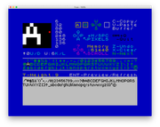
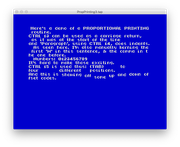
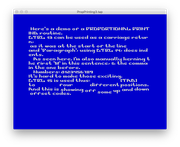
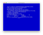
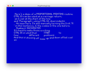
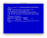
I've then been looking at storing the data that the proportional font can be printed with, and I've made a proportional printing routine (currently 322 bytes) that supports:
CHR$13 - carriage return
CHR$14 - new indented paragraph
CHR$15 - 'TAB' to four different positions (like PRINT, in BASIC - but with four positions)
theres also CHR$ codes to push the print position left/right/up/down by various amounts.
The thing I'm most pleased with is storing the data though for kerning one pixel to the left (the most common thing I'd use), to stop the data having unnecessary bloat with CTRL codes, if a character is stored 'inverted' (so 128+its normal ascii value) it is pushed kerned one pixel tighter to the left. (eg defb "A Useful T",128+"o","ol.") might be used to tuck the first 'o' slightly under the 'T'.)
I started doing 'word wrap' but with the kerning it became a pain to calculate when it was needed, and I'm envisaging this is more for hand tweaked 'text' based output, rather than variable things, so word-wrapping would makes 1.larger and 2.slower which are things I'm trying to avoid.
Here are some screenshots of me testing the print routine with proportional fonts I've been made:

I've now done two versions of the font editor:
1. A 'normal' font editor for editing 8x8 fixed width characters.
Fixed Width Editor TAP file
2. A proportional font editor for editing 7x8 characters. The first byte of each character to store both the width and the +/- offset in the vertical direction for that letter. This means apostrophes can sit 'high', and commas (and letters with 'danglers') can be low (and it's quite possible to have fonts with a effective height of 9 or 10 pixels, all stored in the usual 768 bytes.
Proportional Font Editor TAP file
Both there editors have now the following new commands:
R - 'rotate' letters (Rotating proportional 7x8 characters corrupts the data byte, but it's easy enough to K/L U/D to correct it)
CAPS+R - rotate ALL letters
F - flip a letter horizontally
CAPS+C - copies the system font to 61440 be edited by the user
Plus other keys:
Q,A,O,P with M/Space to toggle pixels
W,S,9,0 to choose the character you're editing (or N, to progress to the 'Next') - note there is no 'store' button. If you change it ... you change it!
5,6,7,8 scrolls the screen (left,down,up,right)
X clear current character
Z revert to when you first selected the character you're editing (a kind of brutal undo, to account for the lack of 'store')
C/V copy and paste (the copy paste buffer is shown)
ENTER - toggles two pages of preview text, in your font. This text isn't updated automatically in the new font, so press 'Enter' to check how it's looking.
CAPS+Q - exit to basic
E - edit the preview text
T - changes the fixed width of the fixed font *(only in the fixed font editor)
T - changes the fixed height (linespacing) of the font, in the preview window *(only in the proportional font editor)
These keys are exclusive to the proportional font editor
K/L - change the width of individual characters on the proportional font editor
U/D - changes the vertical offset up/down of individual characters on the proportional font editor
Most of the keys are shown on the screen.
The edited font is stored at 61440. Exit to BASIC and SAVE "font" CODE 61440,768 (or dump the memory from 61440)
M/c resides at 32768
At some point I'll bundle them together with some fonts on a TXZ file, and a BASIC loader and routine to saving/loading fonts to round the thing off and call it 'complete'. But these are definitely pretty much done now.
I've then been looking at storing the data that the proportional font can be printed with, and I've made a proportional printing routine (currently 322 bytes) that supports:
CHR$13 - carriage return
CHR$14 - new indented paragraph
CHR$15 - 'TAB' to four different positions (like PRINT, in BASIC - but with four positions)
theres also CHR$ codes to push the print position left/right/up/down by various amounts.
The thing I'm most pleased with is storing the data though for kerning one pixel to the left (the most common thing I'd use), to stop the data having unnecessary bloat with CTRL codes, if a character is stored 'inverted' (so 128+its normal ascii value) it is pushed kerned one pixel tighter to the left. (eg defb "A Useful T",128+"o","ol.") might be used to tuck the first 'o' slightly under the 'T'.)
I started doing 'word wrap' but with the kerning it became a pain to calculate when it was needed, and I'm envisaging this is more for hand tweaked 'text' based output, rather than variable things, so word-wrapping would makes 1.larger and 2.slower which are things I'm trying to avoid.
Here are some screenshots of me testing the print routine with proportional fonts I've been made:
Last edited by uglifruit on Wed Feb 26, 2020 2:51 pm, edited 1 time in total.
CLEAR 23855
Re: Proportional Font Routines
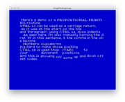
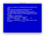
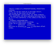
And a few more...
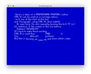
(I know these are not the most exciting screenshots you'll see this week)!
(I know these are not the most exciting screenshots you'll see this week)!
CLEAR 23855
Re: Proportional Font Routines
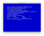
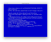
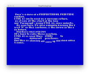
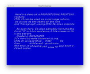
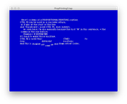
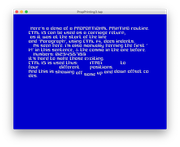
Another boring screenshot alert.
This shows the print routine just doing it's thing, but some of the characters have be kerned one-pixel to the left - but without increasing the data size at all. Characters to be pushed left one pixel are stored with bit 7 set.

LEFT HAND SIDE, has hand kerned data. RIGHT HAND SIDE doesn't. (Notice the improvement on the capital letters).
Maybe it's a subtle difference that interests no-one else, but as an aesthetic improvement I think it's worth having (especially as it costs nothing to the data size).
The data does end up looking like this, though:
This shows the print routine just doing it's thing, but some of the characters have be kerned one-pixel to the left - but without increasing the data size at all. Characters to be pushed left one pixel are stored with bit 7 set.
LEFT HAND SIDE, has hand kerned data. RIGHT HAND SIDE doesn't. (Notice the improvement on the capital letters).
Maybe it's a subtle difference that interests no-one else, but as an aesthetic improvement I think it's worth having (especially as it costs nothing to the data size).
The data does end up looking like this, though:
Code: Select all
defb "H","e"+128,"re'",128+"s"," a d",128+"e","mo of a P",128+"R","O",128+"P","ORT",128+"I",128+"O","N",128+"A","L PRI",128+"N","T",128+"I",128+"N",128+"G",13CLEAR 23855