Karnov and its great use of colour

Share graphical tips, notes and queries related to our favourite screen layout and its editors.
User avatar
patters
Manic Miner
Posts: 470
Joined: Thu Apr 11, 2019 1:06 am

Re: Karnov and its great use of colour

Post by patters »

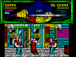
Thanks for the suggestions but I'd class these more alongside R-Type. They tend to overlay one object over another totally and resort to black square edges where background detail goes missing. Karnov seems to be compositing the pixel detail of the background layer and the sprites, and uses a mask so I think the techniques are quite different. Depending on the specific colours in a given clash, sometimes the background colour wins, sometimes it's the sprite colour, and I think that really works well to minimize the impact of the clash.

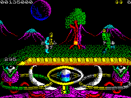
See this example of what I mean - notice the background pixel detail remains in the colour clash around his arms:
Image
User avatar
patters
Manic Miner
Posts: 470
Joined: Thu Apr 11, 2019 1:06 am

Re: Karnov and its great use of colour

Post by patters »

redballoon wrote: Sat Feb 01, 2020 9:42 am There’s also The Real Ghostbusters done by the same people.
Thanks, taken a look at some YouTube footage. It's really a lot less graphically accomplished isn't it, despite being the later title.
Ralf
Rick Dangerous
Posts: 2283
Joined: Mon Nov 13, 2017 11:59 am
Location: Poland

Re: Karnov and its great use of colour

Post by Ralf »

Shadow Warriors are also made in a similar style:

Image
https://spectrumcomputing.co.uk/index.p ... 96&id=4428

The gameplay is so-so but it looks great and is very different from monochrome or mostly monochrome games.
Actually when I saw it first time, I thought it must be using some new graphics mode ;)
User avatar
patters
Manic Miner
Posts: 470
Joined: Thu Apr 11, 2019 1:06 am

Re: Karnov and its great use of colour

Post by patters »

Golden Axe and Shadow Warriors aren't quite the style I was describing, because they have no colour clash, opting instead for those black boxes where the background is totally missing in the character cells used by the sprites, which I personally think looks quite bad.

It's the absence of those kinds of ugly black boxes that struck me about Karnov. Incidentally I recently tried Golden Axe and wow it's unplayable. I used to like completing the game in an arcade with old machines during family holidays, and also played the Megadrive version. The movement on the Spectrum version is abysmal.

Thanks for the Mercs suggestion, will give that a play. It does look a bit like the designers just gave up trying to mitigate the colour clash entirely though, especially later in the video linked to from ZXDB, rather than cleverly minimizing it as with Karnov.

I am particularly impressed by the graphics in Viaje al Centro de la Tierra since they made great use of colour but also had per pixel movement, and the clashing doesn't really stand out.
Last edited by patters on Tue Feb 04, 2020 12:04 am, edited 3 times in total.
User avatar
djnzx48
Manic Miner
Posts: 730
Joined: Wed Dec 06, 2017 2:13 am
Location: New Zealand

Re: Karnov and its great use of colour

Post by djnzx48 »

Maybe also games by Oleg Origin such as Metal Man Reloaded and Valley of Rains. Metal Man uses masking on the main character sprite, so the background graphics don't look so blocky.
User avatar
patters
Manic Miner
Posts: 470
Joined: Thu Apr 11, 2019 1:06 am

Re: Karnov and its great use of colour

Post by patters »

Yes VoR is amazing because the clash depends on the precise colours that are overlapping. It's not as simple as sprite winning over background every time. Also the parallax and the water reflections are incredible touches for a Spectrum.

I only recently tried MetalMan Remixed since I only just discovered that the DivMMC Future reads TRD files. Have finally discovered that multiload games are best enjoyed via vtrd.in in this format, not to mention all the re-releases like R-Type with AY music etc.

Luckily Oleg Origin's site, though gone, can be retrieved via web.archive.org and it's basically the only place to get MetalMan Remixed in English. He seemed to have a lot of projects that were partially worked on: https://web.archive.org/web/20171204022 ... _soon.html

...and then decided to chuck in the towel altogether in 2018:
Artem Orlov (aka Oleg Origin) isn't engaged in creation of games for ZX Spectrum anymore.
'Oleg Origin' was not the real person, but the virtual project. The project is finally closed. Website is closing.
Last edited by patters on Mon Feb 03, 2020 11:53 pm, edited 9 times in total.
User avatar
djnzx48
Manic Miner
Posts: 730
Joined: Wed Dec 06, 2017 2:13 am
Location: New Zealand

Re: Karnov and its great use of colour

Post by djnzx48 »

Does Valley of Rains use masking? I thought all the graphics were drawn straight to the screen buffer as 8x8 characters, with sprites on top getting priority when there's overlap.
User avatar
patters
Manic Miner
Posts: 470
Joined: Thu Apr 11, 2019 1:06 am

Re: Karnov and its great use of colour

Post by patters »

djnzx48 wrote: Mon Feb 03, 2020 11:29 pm Does Valley of Rains use masking? I thought all the graphics were drawn straight to the screen as 8x8 characters, with sprites on top getting priority when there's overlap.
I don't think it's masked, but attributes of the bg layer are sometimes preserved/combined as a sprite crosses it. I remember noticing that when the main character's hair moves past say a mushroom.
Ralf
Rick Dangerous
Posts: 2283
Joined: Mon Nov 13, 2017 11:59 am
Location: Poland

Re: Karnov and its great use of colour

Post by Ralf »

...and then decided to chuck in the towel altogether in 2018:
Artem Orlov/Oleg Origin is a bit mysterious person And you can't be really 100% sure what true about him and what's fake.
Some people even claimed that he doesn't exist, that his games were a project of several people.

But I believe he exists, he's a single, real man and I also believe he... didn't abandon writing games for Spectrum.
I wouldn't be so surprised if he was somehow involved in Valley of Rains ;)
User avatar
Audionautas
Manic Miner
Posts: 255
Joined: Sat Nov 25, 2017 12:00 pm
Location: Spain

Re: Karnov and its great use of colour

Post by Audionautas »

Ralf wrote: Tue Feb 04, 2020 9:56 am
...and then decided to chuck in the towel altogether in 2018:
Artem Orlov/Oleg Origin is a bit mysterious person And you can't be really 100% sure what true about him and what's fake.
Some people even claimed that he doesn't exist, that his games were a project of several people.

But I believe he exists, he's a single, real man and I also believe he... didn't abandon writing games for Spectrum.
I wouldn't be so surprised if he was somehow involved in Valley of Rains ;)
Behind Zosya Entertainment (the people who did Valley of Rains, Drift! and Just a Gal for the Yandex Retro Games Battle 2019), there's a team. The spokeswoman for this development team on social networks and press interviews is Natasha Zotova (also programmer in the group and author of an awarded BASIC game called Lava).

You can find news related to Zosya here (https://vk.com/zosya_net). I especially recommend reading these two interviews with Natasha Zotova (https://idpixel.ru/news/1874-intervju-s ... -of-rains/) and (https://idpixel.ru/news/1924-obzory-igr ... rtainment/), they are working on more than 50 Spectrum games that are in different stages of development, and some of them will be released in 2020.

I think it's clear Zosya it's a team effort of anonymous developers. I think Oleg Origin is simply an alias, but the man/woman behind that alias is clearly involved in Zosya. Valley of Rains shares a lot of techniques previously developed on Metal Man Reloaded.
User avatar
patters
Manic Miner
Posts: 470
Joined: Thu Apr 11, 2019 1:06 am

Re: Karnov and its great use of colour

Post by patters »

Wow, I had not idea it was that mysterious. It's like some sort of art movement. I guess that's good news, it would have been a bit of a shame if such a talent had changed interests.
User avatar
Juan F. Ramirez
Bugaboo
Posts: 5133
Joined: Tue Nov 14, 2017 6:55 am
Location: Málaga, Spain

Re: Karnov and its great use of colour

Post by Juan F. Ramirez »

Back to topic... what about AMC?

Image
User avatar
RWAC
Manic Miner
Posts: 700
Joined: Sun Aug 18, 2019 9:59 pm

Re: Karnov and its great use of colour

Post by RWAC »

Juan F. Ramirez wrote: Tue Feb 11, 2020 9:25 pm Back to topic... what about AMC?

Image
Great music too!
User avatar
Joefish
Rick Dangerous
Posts: 2058
Joined: Tue Nov 14, 2017 10:26 am

Re: Karnov and its great use of colour

Post by Joefish »

There's a lot of colour there, but unfortunately the sprite designs just aren't as good. A bit like Golden Axe or Altered Beast conversions.
User avatar
Ivanzx
Manic Miner
Posts: 736
Joined: Tue Nov 14, 2017 9:51 am

Re: Karnov and its great use of colour

Post by Ivanzx »

Joefish wrote: Wed Feb 12, 2020 12:51 am There's a lot of colour there, but unfortunately the sprite designs just aren't as good. A bit like Golden Axe or Altered Beast conversions.
The sprite design in AMC is light years above Golden Axe :roll:

There are some very well drawn monsters and creatures, plus the main character. Also the size of them is much bigger than in Golden Axe ;)
User avatar
Lethargeek
Manic Miner
Posts: 742
Joined: Wed Dec 11, 2019 6:47 am

Re: Karnov and its great use of colour

Post by Lethargeek »

always liked AMC but it's blocky without any color clash by design so it doesn't fit the OP request
User avatar
Joefish
Rick Dangerous
Posts: 2058
Joined: Tue Nov 14, 2017 10:26 am

Re: Karnov and its great use of colour

Post by Joefish »

OK, maybe that was a bit unfair, but the sprites are obviously forced into the character squares which makes them look unnatural and animate in jerky motions. Better to design them as they are meant to be, then make more space around them to avoid the colour clash, as per the point of this thread. Or at least keep the things they pass in front of fairly sparse, so you can obscure a larger area without obviously damaging the background.

And yes, having reminded myself of what it looks like, nothing showcases the Spectrum's display as badly as Altered Beast...

The parallax scrolling in AMC doesn't really work for me either though. I think the background needs to move in smaller steps as it's hard to tell that it is moving separately from the foreground at all.

Of course the release Valley of Rains hasn't helped as it just does everything so much better!
+3code

Re: Karnov and its great use of colour

Post by +3code »

Ivanzx wrote: Wed Feb 12, 2020 8:19 am
Joefish wrote: Wed Feb 12, 2020 12:51 am There's a lot of colour there, but unfortunately the sprite designs just aren't as good. A bit like Golden Axe or Altered Beast conversions.
The sprite design in AMC is light years above Golden Axe :roll:

There are some very well drawn monsters and creatures, plus the main character. Also the size of them is much bigger than in Golden Axe ;)
I agree, but it‘s (colourfull) character based movement, too Turrican 1.
User avatar
Lethargeek
Manic Miner
Posts: 742
Joined: Wed Dec 11, 2019 6:47 am

Re: Karnov and its great use of colour

Post by Lethargeek »

+3code wrote: Wed Feb 12, 2020 12:07 pm
Ivanzx wrote: Wed Feb 12, 2020 8:19 am The sprite design in AMC is light years above Golden Axe :roll:

There are some very well drawn monsters and creatures, plus the main character. Also the size of them is much bigger than in Golden Axe ;)
I agree, but it‘s (colourfull) character based movement, too Turrican 1.
btw Turrican 1 has a little bit of color clash though
+3code

Re: Karnov and its great use of colour

Post by +3code »

Lethargeek wrote: Wed Feb 12, 2020 12:12 pm
+3code wrote: Wed Feb 12, 2020 12:07 pm I agree, but it‘s (colourfull) character based movement, too Turrican 1.
btw Turrican 1 has a little bit of color clash though
Turrican 2 (pixel based movement) has, but Turrican 1 (one of my favourites games, I still have the tape) I think runs without color clash.
User avatar
Lethargeek
Manic Miner
Posts: 742
Joined: Wed Dec 11, 2019 6:47 am

Re: Karnov and its great use of colour

Post by Lethargeek »

+3code wrote: Wed Feb 12, 2020 12:22 pm
Lethargeek wrote: Wed Feb 12, 2020 12:12 pm btw Turrican 1 has a little bit of color clash though
Turrican 1 (one of my favourites games, I still have the tape) I think runs without color clash.
level one - sprites overlapping the vegetation, maybe more on the later levels
User avatar
Joefish
Rick Dangerous
Posts: 2058
Joined: Tue Nov 14, 2017 10:26 am

Re: Karnov and its great use of colour

Post by Joefish »

It's weird; the enemy sprites move in character squares and use transparent PAPER to show through the background, but for some reason they also set their colours one extra character to the left, which leads to the clashes. You can see it on the magenta robots.

The main character seems to be drawn with a wide pixel mask, but is completely dependent on the background INK colour. That is mostly black when against the cyan sky, but changes to red when the background is black. It's quite neat, and also works well in front of the waterfalls (where the INK is blue and the PAPER white). The only place it looks a mess is on the edge of those black rock formations, where they've actually drawn them with black PAPER and cyan INK against the sky, so the player sprite appears inverted over those character squares.
WDeranged
Drutt
Posts: 19
Joined: Tue Apr 14, 2020 10:28 pm

Re: Karnov and its great use of colour

Post by WDeranged »

No mention of Teenage Mutant Ninja Turtles?

Image
Post Reply