Page 3 of 6
Re: "Go-Go BunnyGun", first screen grabs.
Posted: Sun Mar 03, 2019 9:01 am
by Pegaz
DouglasReynholm wrote: ↑Sat Mar 02, 2019 10:42 pm
Ast A. Moore wrote: ↑Sat Mar 02, 2019 10:21 pm
Looking great. I’ve always loved cyan on the Spectrum.
Always loved the Speccy colour palette, so vibrant, even given it's limitations. The C64 had more colours yes, as did the 464. But in those modes the pixels were widened and blocky to boot. The 464 had a nice palette, could put out some nice pics given the care it rarely got, but the palette of the 64 was awful, really earthy/muddy. I'll go for the attribute clash and the better resolution thanks.
Wow, just 3 posts and we've already got to blocky / earthy / muddy commode ...

I like the Spectrum palette too, but I never liked color clash and I often wanted to have orange color and more gray shades, but I learned to live with it.
All 8bit computers have their limitations, even the best among them as MSX 2 and BBC Master.
Blockiness has never been a issue for me back in the day on old crt TVs, even in multicolour mode, and especially not in hires 320x200 resolution.
If the colors are washed out, increase the saturation, how difficult it can be...
After all I'm not playing a palette, but good games and c64 and Spectrum are the best on that matter.
Re: "Go-Go BunnyGun", first screen grabs.
Posted: Sun Mar 03, 2019 9:50 am
by dfzx
Joefish wrote: ↑Sun Mar 03, 2019 6:07 am
'Ionian' comes from...
Oh, right! When I saw the graphic I read it as "eye-onion"!
Re: "Go-Go BunnyGun", first screen grabs.
Posted: Sun Mar 03, 2019 12:02 pm
by Ast A. Moore
Joefish wrote: ↑Sun Mar 03, 2019 6:07 am
I think I needed my own label if I've made more than one game! 'Ionian' comes from sitting at a desk here while writing the
Buzzsaw+ title screen multicolour code.
I just call it natural major. There’s no need to go all fancy with Ionian or Aeolian. The rest of them make sense, of course, but these two—come on!

Re: "Go-Go BunnyGun", first screen grabs.
Posted: Sun Mar 03, 2019 12:18 pm
by R-Tape
Skegpool is looking splendid in that pic Joe

Eek. The chemist in me read it as 'ionion', which I thought was a great name!
Re: "Go-Go BunnyGun", first screen grabs.
Posted: Sun Mar 03, 2019 1:40 pm
by Joefish
Well, the confusion is understandable; the blue domes are more typical of Dodecanese architecture than Ionian.
Anyway, is 'Ga-Ga BunnyGun' so bad?
I've made a few tweaks, but making the 'o's rounder means either a bigger mask or the odd white pixel on the blue logo...

Re: "Go-Go BunnyGun", first screen grabs.
Posted: Sun Mar 03, 2019 8:36 pm
by Joefish
Maybe if I make the dash a dot, each 'o' can be a pixel wider, then I can try to make them look a bit rounder...
I could extend the whole text a few pixels to the left, but I originally kept it in line with the top of the text below... Not sure if it needs to be...
Re: "Go-Go BunnyGun", first screen grabs.
Posted: Sun Mar 03, 2019 9:42 pm
by Juan F. Ramirez
R-Tape wrote: ↑Sun Mar 03, 2019 12:18 pm
Skegpool is looking splendid in that pic Joe
The first thing that came to my mind when I saw the pic was Star Wars episode One.
Yeah, I'm that geek.
Re: "Go-Go BunnyGun", first screen grabs.
Posted: Mon Mar 04, 2019 11:33 am
by Joefish
That's not quite Naboo, but I have some pictures from yonks ago taken in the Italian lakes; they were used in Episode III...
Re: "Go-Go BunnyGun", first screen grabs.
Posted: Mon Mar 04, 2019 2:38 pm
by stupidget
Joefish wrote: ↑Mon Mar 04, 2019 11:33 am
That's not quite Naboo, but I have some pictures from yonks ago taken in the Italian lakes; they were used in Episode III...
I've not heard the word 'Yonk' used for years!!! Out of interest, how long do you think a yonk is, more than a Donkey, but less than ages?
Re: "Go-Go BunnyGun", first screen grabs.
Posted: Mon Mar 04, 2019 4:00 pm
by Joefish
Well, I asume 1 'yonk' = 1 'donkey's year'. But I've no idea how long 'donkey's years' are either.
It's conventionally a long time, though a donkey's life expectancy is less than a human's, so it's not as if it would be an extension in the way that 'dog years' are assumed to be shorter than a 'human year'. And the idea that it's actually 'donkey's ears' as rhyming slang for 'years' is invalidated by it being a phrase that long pre-dates rhyming slang. There may be some pun in a donkey's years being as long as a donkey's ears, but that's long lost to history. So f*ck knows, basically.
Re: "Go-Go BunnyGun", first screen grabs.
Posted: Sat Apr 06, 2019 11:27 pm
by Joefish
OK, you can now shoot enemies and they explode and die!
And there are solid rock obstacles that block your shots.
The player still can't collide with anything. And the enemies don't move or fire back.
Still, while you're waiting, check out these pictures of some cheeky cosplay bunny action from GEEKxGIRLS:
http://geekxgirls.com/article.php?ID=3902
Re: "Go-Go BunnyGun", first screen grabs.
Posted: Sat Jul 27, 2019 11:05 pm
by Joefish
First go at the
Go-Go BunnyGun loading screen now up on ZXArt:

https://zxart.ee/eng/authors/j/joefish/
Re: "Go-Go BunnyGun", first screen grabs.
Posted: Thu Aug 08, 2019 11:08 am
by Ivanzx
Looking good! Although perhaps the title logo could have another coloque to improve its readability

Re: "Go-Go BunnyGun", first screen grabs.
Posted: Thu Aug 08, 2019 11:40 am
by Joefish
Thanks.
I know what you mean - there isn't much contrast between white and cyan. But blue on white is too dark.
I've tried moving it down below the blue bit at least. If I could do it blue-on-cyan it might look good, but that makes it very difficult to have the cyan sky stipple down to white.
Maybe I can redraw it to better fit character squares, so I can then recolour it. Here I've re-used the logo I'd drawn to use in the game, with an outline added because it was inverted, and that made has made it spill over into more characters. I might have to scrap the in-game one anyway, or shrink it, as I'm running out of memory!
Re: "Go-Go BunnyGun", first screen grabs.
Posted: Thu Aug 08, 2019 8:51 pm
by R-Tape
Argh sorry Joe—I'm not very keen on this screen. The bottom segment is decent, especially the outlines of the hair and blades of grass, but the green to white of the sky looks totally wrong to me.
I'm not averse to the theme, far from it, but how does it fit the game?
Re: "Go-Go BunnyGun", first screen grabs.
Posted: Fri Aug 09, 2019 12:28 pm
by Joefish
R-Tape wrote: ↑Thu Aug 08, 2019 8:51 pm
Argh sorry Joe—I'm not very keen on this screen. The bottom segment is decent, especially the outlines of the hair and blades of grass, but the green to white of the sky looks totally wrong to me.
I'm not averse to the theme, far from it, but how does it fit the game?
I just wanted to do something completely different to the usual loading screen, of trying to depict some hyper-realistic version of the game itself. What's the point in doing that anyway? It just seems to me to highlight how lacking the in-game graphics are compared to a static screen. And I really wanted to take a stand against all-black backgrounds! (Sorry!
) My intention for the game has always been to use Animé styling, as if it was the game of some cartoon show. So it's one of the pilots having some down-time before it all kicks off. I thought that was clear - she's got the ears on and is in some sort of jumpsuit, just like the sprites I've drawn. The plan was to have one or more other flyers zipping overhead, but I'm not sure I'm that good at drawing 3D objects! (And anyway, that'd leave nowhere for the title to go

).
It at least seemed to me more relateable than just randomly depicting some half-naked alien 'Lady Not-Appearing-In-This-Game', or, for that matter, some shocking case of acute infant hypoxia! (ahem)
Not sure what the problem is with going from green hills to white then fading to cyan and blue higher up though. Seems to me that skies kind of do that. I'd use more shades of blue if I had them! And switching BRIGHT on and off makes it harder to use stipples for longer transitions, or to then draw INKed objects over the top of those transitions without them taking on the bands of shading too. Surely going from green straight to cyan is far more jarring? I suppose I could bring the cyan stippling down, though it would have to fit around that 'ear'. Again, if I could be bothered, maybe I should be drawing cloud outlines in the sky instead of just plain stipples, then I could work that around other objects.
I'm still not finished with it, anyway. I've added more details to the hair and the outfit, and I'm trying to improve the logo. If I can draw something interesting in the sky in its place, I might just leave the title off altogether...


Re: "Go-Go BunnyGun", first screen grabs.
Posted: Fri Aug 09, 2019 12:53 pm
by redballoon
Yip, I’d say that clouds are your best pal here. A section of the sky with clouds where the ears are would mean no stippling and therefore no clash or workaround on the ears. It’d also mean you could lower the logo by a couple of pixels, too, which I think would be helpful.
On my phone so I can’t show examples at the moment (I’ll do that when I get home later) but I use clouds on the horizon for this type of stuff. On non-Spectrum art, I use it as both a stylistic and framing device but on the Spectrum it has the added benefit of preventing any attribute clash.
I’m not even going to hide the fact that I’m influenced by the landscapes from Studio Ghibli films where there’s land and sky!
Re: "Go-Go BunnyGun", first screen grabs.
Posted: Fri Aug 09, 2019 1:49 pm
by Ralf
The weakest point of that screen is invisible title. The rest is okay for me. Personally I maybe I would do some stuff differently but everybody has his own style.
Re: "Go-Go BunnyGun", first screen grabs.
Posted: Fri Aug 09, 2019 2:15 pm
by Joefish
redballoon wrote: ↑Fri Aug 09, 2019 12:53 pmI’m not even going to hide the fact that I’m influenced by the landscapes from Studio Ghibli films where there’s land and sky!
'Ghibli'? Nope, can't say I've ever heard of it, nor been influenced by it in any way whatsoever...
Ahem.


Re: "Go-Go BunnyGun", first screen grabs.
Posted: Fri Aug 09, 2019 2:23 pm
by Joefish
Ralf wrote: ↑Fri Aug 09, 2019 1:49 pm
The weakest point of that screen is invisible title. The rest is okay for me. Personally I maybe I would do some stuff differently but everybody has his own style.
The biggest problem I have with it is the inconsistency of colours between emulators and renderings of ZX Spectrum graphics, and across different monitors as well. I deliberately kept BRIGHT off, but the contrast between cyan and white varies enormously, making it hard to judge what you can get away with.
But yes, I agree it's not good enough. If there was an in-between shade of mid-blue I'd do the sky in that and the title in white. But making the ground go from green to cyan then fade up to blue is too overwhelming with colour - it all looks over-saturated.
I need to re-do the title in solid colour somehow. Or maybe add some sort of darker geometrical shape behind it so it's more visible (anyone got a gallery of corny 80s video titling?).
Re: "Go-Go BunnyGun", first screen grabs.
Posted: Fri Aug 09, 2019 4:33 pm
by Fahnn
Joefish wrote: ↑Thu Aug 08, 2019 11:40 am
Thanks.
I know what you mean - there isn't much contrast between white and cyan. But blue on white is too dark.
I love the screen (lower half), but I think blue on white for the logo in the upper half would be fine. I guess you must have tried it but does it really look that bad? I'm only imagining it but I think it could look pretty cool, especially as it's all fairly bright in the lower half.
Re: "Go-Go BunnyGun", first screen grabs.
Posted: Fri Aug 09, 2019 5:02 pm
by Joefish
Blue on white is such a high contrast it's hard to tell that it's not just simply black - particularly for just the thin outlines and stipples I've used so far. You need big patches of colour to tell it's blue, when the background is so bright.
Blue on cyan works but as I say, a big patch of any colour in the background messes with any chance of shading gradients. As has been suggested, it needs re-doing, probably with clouds, and/or some sort of geometric background coloured patch behind the text.
If I make it so that it looks like white clouds start along the horizon and bubble up, I could maybe then switch fairly sharply to cyan in the central region of the screen and do the logo in blue on that... But I think re-drawing might still be the better option.
Re: "Go-Go BunnyGun", first screen grabs.
Posted: Fri Aug 09, 2019 5:44 pm
by Joefish
As for the game, I think I've drawn too many sprites now - I think there's some 12K of sprite data, and no proper levels in yet.
They can't all have 8 frames of animation, as that's 720 bytes for one sprite. I need to cut down! Rely more on the ability to re-colour sprites on-the-fly for variety.
In the top 32K of memory I've got around 9.5K of screen maps and buffers, 1K of variables, 12K of sprites and 8K of code (which is a lot; quite inefficient of me, but then that's down to semi-unwrapped copy loops and all those different firing modes), which only leaves a few K still to go. The background graphics are all copied down to lower memory when it gets going, and I think the level data and enemy path programming will have to go there too. That's another 9.25K of memory of which I've only used a couple of K so far.
At the moment I'm trying to work out if I can afford custom code for the bosses, or whether to implement them as just pathed baddies. I can already cluster sprites so they move in unison, but I'm not sure if that's enough to make for a good boss fight. It'd be neat if the boss can change its pattern of behaviour as it gets near to exploding, or spawn new enemy sprites as a way of attacking you, but I don't know if I can afford the code space. Then again, adding too much complexity to the baddie pathing so it can do bosses may take up more memory than just writing custom boss code...
Re: "Go-Go BunnyGun", first screen grabs.
Posted: Fri Aug 09, 2019 6:04 pm
by redballoon
Joefish wrote: ↑Fri Aug 09, 2019 2:15 pm
'Ghibli'? Nope, can't say I've ever heard of it, nor been influenced by it in any way whatsoever...
Ahem.
Anyway, home now. So yeah, to allow me to have things in the foreground that also overlaps the sky (as well as used as a framing device and look good
), clouds starting on the horizon was the way to go.

But I do like that effect (and as said before, being a big fan of the Ghibli background art), I use it in non-Spectrum pixel art, this one being an example.

But if you don't want clouds on the horizon then if you don't go for sky banding and stick to solid colours, then you can try the following

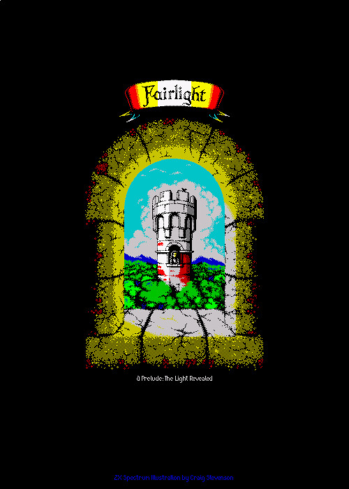
I'm not a big fan of uniform dithering anyway though I
did try it in both the Pixel Quest and Fairlight art and hated it even more then tried non-uniform dithering which I liked but felt that it was unnecessary for the illustration.
Ach, anyway, just some cloud suggestions/ideas for you

Re: "Go-Go BunnyGun", first screen grabs.
Posted: Fri Aug 09, 2019 11:52 pm
by Joefish
Yep, the
Fairlight one is brilliant. It's
a tad blatant around the rocket, but still a great pic!
