Love the site! Fantastic. Looks great!
SimonPlumbe wrote: ↑Tue Apr 30, 2024 2:16 pm
Would love your feedback and suggestions though.
A few humble suggestions off the top of my head…
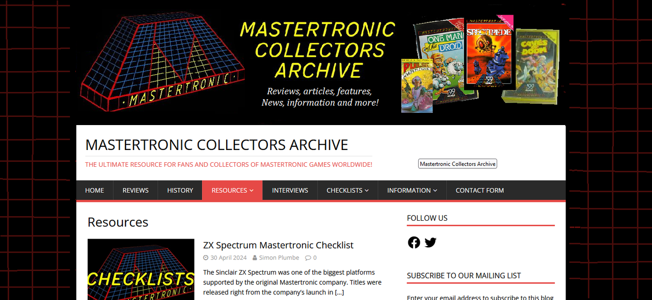
1. On the main banner image, maybe you could add a bunch of game covers to the right side, to show what the site is all about and make it more exciting? The list of features could be moved to a line across the bottom?
2. The black main banner feels a little 'constricted' by the white either side, especially with the text up to the edge. Could you try having a black panel behind the banner which extends all the way to the edge, or just make all the left and right background edges black (even for the 'day' theme)?
3. I would try a 'grid' background, too, to tie in with the logo.
4. I would change the "Checklists" menu heading to "Games" or "The Games" which is perhaps more descriptive?
A crude mock-up of some of these ideas (hastily slapped together):