
It's not pleasing to my eyes and I simply can't get used to it.
Someone here, has a signature - If it's working, don't touch it, at all...
Maybe it's not a bad thing, to stick to it in this case as well.
NEW THEME! for the Spectrum Computing Forums

Not for me -- thank you
As others have already mentioned, the contrast in the new theme is way too high for my liking.
• The white background is too bright and strains my eyes.
• The black/dark gray buttons and black borders are too heavy. They draw too much attention as a result.
• I’m not against Open Sans as a typeface but the running text is a) too small and b) too heavy in weight.
• The white background is too bright and strains my eyes.
• The black/dark gray buttons and black borders are too heavy. They draw too much attention as a result.
• I’m not against Open Sans as a typeface but the running text is a) too small and b) too heavy in weight.

Re: NEW THEME! for the Spectrum Computing Forums
Thanks for all the constructive comments for @druellan.
You can switch to the new alternative theme following the instructions on the opening post of this topic.
Please continue to feedback.
You can switch to the new alternative theme following the instructions on the opening post of this topic.
Please continue to feedback.

Re: NEW THEME! for the Spectrum Computing Forums
If you have the chance to see the desktop version, I pretty much want to hear your opinion!
We changed it slightly, is still a problem?• The white background is too bright and strains my eyes.
Now that we have a gray background, I was thinking on changing the ones inside the topics as something plain (like ZX81• The black/dark gray buttons and black borders are too heavy. They draw too much attention as a result.

I also thought that, but on a side by side comparison turns out the Open Sans is a bigger, more readable font that the Trebuchet MS originally used by the forum. But I only tested it on Windows + cleartype.• I’m not against Open Sans as a typeface but the running text is a) too small and b) too heavy in weight.
Re: NEW THEME! for the Spectrum Computing Forums
I mostly like the old colors. The contrast is more pleasing to the eyes ( mine at least).
Maybe a dark theme would be better.
Maybe a dark theme would be better.

Re: NEW THEME! for the Spectrum Computing Forums
Thank you.
Yes appreciate the work / effort into it. As I've said I do understand how long it takes to get it right, having done this myself.
The button spacing for drafts under the posting window look the same in FF at least, the search too. I did hard refresh to be sure with CTRL+F5 and CTRL+R but FF has a strange habit sometimes of keeping it.
The other bits now look good!
Re: NEW THEME! for the Spectrum Computing Forums
First of all @druellan I want to say that I appreciate the effort to make a custom theme. Because I know it is bloody hard and you will get a lot of negative feedback if you change something that people are so familiar with. I also appreciate that @PeterJ is giving room to these kinds of initiatives.
On my machine (MacBook Pro, 13" retina screen, macOS Mojave) the original theme is using Lucida Grande, which is also small but because of the lighter weight and more generous spacing is more readable. Open Sans renders a lot heavier, and has slightly less whitespace between the lines as well.


Please have a look below at two screenshots of the same post in the original and the new theme.
On my machine (MacBook Pro, 13" retina screen, macOS Mojave) the original theme is using Lucida Grande, which is also small but because of the lighter weight and more generous spacing is more readable. Open Sans renders a lot heavier, and has slightly less whitespace between the lines as well.
-
1024MAK

- Bugaboo
- Posts: 3134
- Joined: Wed Nov 15, 2017 2:52 pm
- Location: Sunny Somerset in the U.K. in Europe
Re: NEW THEME! for the Spectrum Computing Forums
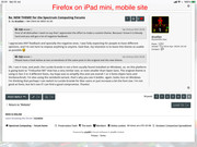
So I have just tried the following:
- Firefox on an iPad mini - the only part of the background picture is a very thin border, making it completely pointless.
- Firefox on a PC running Linux - like on the iPad mini, except you can see a little bit more of the picture, but only just enough to make out a thin slice of the 4 and E keys of a rubber key Speccy keyboard, on the sides, the width is about the same width as a forum page number icon.
- Firefox on a Laptop running Windows 10 - This time it's possible to see a bit more of the picture. I still can't see the whole 4 or E key though.
So my conclusion: I still think such background pictures are a waste of time, effort and bandwidth. At least it does not affect the readability of the text and other content.
I can grab some screenshots if you want.
Mark
“There are four lights!”
Step up to red alert. Sir, are you absolutely sure? It does mean changing the bulb
Looking forward to summer later in the year.
Re: NEW THEME! for the Spectrum Computing Forums
I appreciate ANY feedback and specially the negative ones. I was fully expecting for people to have different opinions, and I'm not here to impose anything to anyone. Said that, my intention is to leave this theme as usable as possible
Oh, I see it now, and yeah, the Lucida Grande is not a font usually found installed on Windows, so, on this platform is going back to "Trebuchet MS" that has a very similar size, or even smaller than Open Sans. The original theme is using in fact 3 or 4 different fonts, my hope was to simplify this and use overall 1 or 2 fonts (Open Sans and Verdana/Arial). I'm also using the semibold variant, that's why you see it bolder, again, looks nice on Windows.
I'm thinking that perhaps I can switch to Lucida Grande for Mac users or just increase a bit the font size. I'm not good at fonts, but let's see if I can find a good compromise. Thanks!
-
1024MAK
- Bugaboo
- Posts: 3134
- Joined: Wed Nov 15, 2017 2:52 pm
- Location: Sunny Somerset in the U.K. in Europe
Re: NEW THEME! for the Spectrum Computing Forums
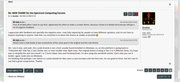
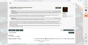
The brightness of this theme does not seem as bad on a PC or laptop.
Anyway, here are some screenshots:
iPad mini:


Firefox on Linux PC
Firefox on Laptop running Windows:
Firefox on Linux PC with me having changed the background colours

The background colours used for this are:
Quoted text background; cacaca
Post entry text background: e3e3e3
Rest of page background: f0f0f0
Despite my reservations, I appreciate the effort that has been put into this.
Mark
Anyway, here are some screenshots:
iPad mini:
Firefox on Linux PC
Firefox on Laptop running Windows:
Firefox on Linux PC with me having changed the background colours
The background colours used for this are:
Quoted text background; cacaca
Post entry text background: e3e3e3
Rest of page background: f0f0f0
Despite my reservations, I appreciate the effort that has been put into this.
Mark
“There are four lights!”
Step up to red alert. Sir, are you absolutely sure? It does mean changing the bulb
Looking forward to summer later in the year.
Re: NEW THEME! for the Spectrum Computing Forums
This new theme excellent, but my old eyes can't cope with the brightness. If I was 20 years younger I'd be all over it like a rash.
Re: NEW THEME! for the Spectrum Computing Forums
I'd like to see a theme based on Sinclair font 
To save paper I use the smallest size and Verdana which I find most readable.
If you want to improve usability on small devices, you may find ways to get more padding between buttons.
To save paper I use the smallest size and Verdana which I find most readable.
If you want to improve usability on small devices, you may find ways to get more padding between buttons.

Re: NEW THEME! for the Spectrum Computing Forums
Yes, I like to read the forums this way. I make double sided documents and choose 8 point Verdana in bold. Saving ink is not a problem as I go to a copy shop but one could choose Century Gothic in grayscale if readability is secondary.Lol
Re: NEW THEME! for the Spectrum Computing Forums
Thanks Mark. It was not my intention to make you take screenshorts of everything at your hand, but I really appreciate the effort, this is handy for sure.

Re: NEW THEME! for the Spectrum Computing Forums
I'm going to have to make better jokes now I know they have a carbon footprint!
Re: NEW THEME! for the Spectrum Computing Forums
This is fascinating. It would be excellent to see a photo of you at the copy shop with your Spectrum Computing printouts.

Re: NEW THEME! for the Spectrum Computing Forums
Just took a peak at the "ZX prosilver" style.
Nothing to point out at first sight, except that it has too much BRIGHT 7.
If someone, is actually printing the forum (sometimes, it might be handy to print), the CSS can have specific rules for printing, that can make the pages just white paper with black text, and remove all unnecessary items, like buttons and the like.
Re: NEW THEME! for the Spectrum Computing Forums
The forum already has a wrench button to send the current page of a thread to the print view style.
By the way, there is an extension called " Print all posts in a topic"
Re: NEW THEME! for the Spectrum Computing Forums
Small tweak requested to the new theme -- all text is currently in bold:
Test
Test
Looks like this currently:

Test
Test
Code: Select all
[b]Test[/b]
Test
Re: NEW THEME! for the Spectrum Computing Forums
I reduced the contrast a bit more. Also, removed the photo background, so performance is going to be better.Just took a peak at the "ZX prosilver" style.
Nothing to point out at first sight, except that it has too much BRIGHT 7.
I'm playing with some backgrounds. Darker ones look really nice, I'm probably going to settle on one of those.
I have control over the print styles, in case they need some tweaking.The forum already has a wrench button to send the current page of a thread to the print view style.
By the way, there is an extension called " Print all posts in a topic"
Re: NEW THEME! for the Spectrum Computing Forums
Thanks, Stu, and yeah, I was kind of expecting some shenanigans with the fonts, I'm using an Open Sans 600 that looks really nice, but on Mac is kind of small, and replacing it with Lucida Grande makes everything bold. I'm going to apply a fix for that.
-
1024MAK
- Bugaboo
- Posts: 3134
- Joined: Wed Nov 15, 2017 2:52 pm
- Location: Sunny Somerset in the U.K. in Europe
Re: NEW THEME! for the Spectrum Computing Forums
Is it possible to change the colour of the text when the CODE tags are used?
Onlyon a white background is not the easiest to read…
Mark
Only
Code: Select all
LIGHT GREENMark
“There are four lights!”
Step up to red alert. Sir, are you absolutely sure? It does mean changing the bulb
Looking forward to summer later in the year.