I'm not sure if it would actually be possible to make a mod version like this, but if anyone wanted to try, I'd be happy to provide attribute data for every single screen

I also wonder how much space is used by the "Welcome back" speech sample which plays very rarely and some may deem could be dropped?
Finding a coder to turn your graphics into a real game could be hard but maybe you could make a map of the game made of them andBut if anyone ever wants to do it, I can supply all the colour data!
Thanks Ralf

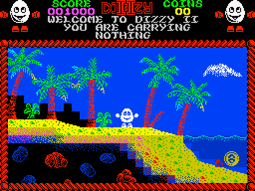
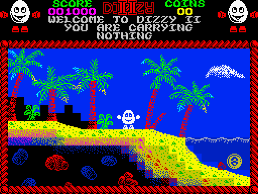
And here is where we run into a terminal problem - I don't know why I didn't see this before. The first two Dizzy games had a characteristic which was probably part of the game engine (I haven't disassembled the entire game so I couldn't confirm it absolutely, but my observations tell me it's 99% likely to be true) - BRIGHT 1 was for background objects that Dizzy could pass through, BRIGHT 0 was for solid objects. You can see it in the opening screen of the original game, with the well, cauldron and the platform in the tree - these are all BRIGHT 0, but the tree and the leaves are BRIGHT 1. And in the opening two screens of Treasure Island Dizzy, the chest is BRIGHT 1, but drop it by the cliff and it's BRIGHT 0.Lethargeek wrote: ↑Tue May 10, 2022 7:24 am not bad, except the blue boulders (better make it different bright reds)...
so maybe make it simpler: everything sky bright1, everything underwater (below the wave row) bright0
That does look very good.
That sounds vaguely like (iirc) how Technician Ted has its room data stored, a list of instructions well sort of.AndyC wrote: ↑Mon May 09, 2022 2:25 pm If I remember correctly, the screens are built from a list of instructions like "platform", "tree trunk" "hut", "palm leaves" etc, with each item being defined a colour. So each drawn item would have to be one colour, as would the entire background (I assume this was to make it easier on the C64 where high resolution mode has an overall shared background. Probably also avoids weird situations when the data is mapped onto the CPC four colour screen where an object could end up with the same foreground/background colour).
I would say it's a very common way (b approach below), from my experience I would say there are two main approaches to store location data:That sounds vaguely like (iirc) how Technician Ted has its room data stored, a list of instructions well sort of.
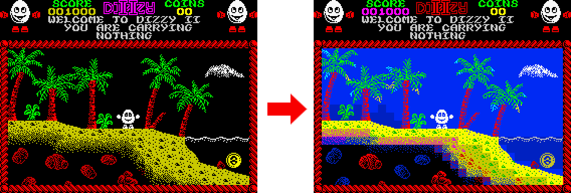
Good point. My 'background hills' did accidentally have some mixed brightness. I've corrected this now (below) and I don't consider this a problem any more. It looks fine IMHO:Lethargeek wrote: ↑Tue May 10, 2022 7:24 am not sure about the sky/water bright use as the bright is shared for ink and paper, it will look more like shading than faraway mountains
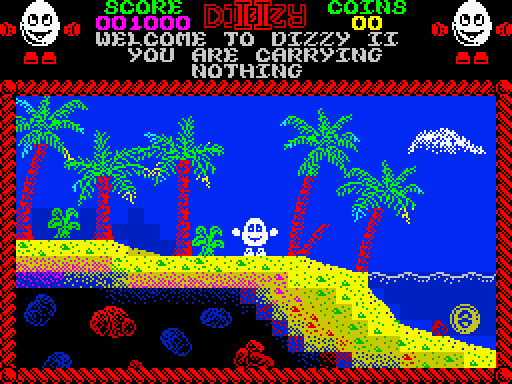
I know what you mean, though it doesn't bother me. Anyway, that kind of terrain only occurs in a couple of screens of the game, so it's not a big issue. As for the multi-coloured underground rocks - I think it looks fun and atmosphericLethargeek wrote: ↑Tue May 10, 2022 7:24 am also underwater sand line look very jagged and eye-soaring
Fascinating! As a huge Dizzy fan, this is something I never noticed before about those games! But it does not concern me at all. I certainly would not call it a "terminal problem"! LOL
I suspect it mostly because they wanted the game to appear bright and the vast majority of it is background that Dizzy can walk past. Having the non-passable objects be darker lets the code cheat by checking attributes before moving rather than having to maintain a whole separate array of whether part of the screen is passable or not. It's not uncommon for 8-bit games to sneak a bit of extra memory space by reusing data in this kind of way.Lee Bee wrote: ↑Thu May 12, 2022 1:34 pm I don't actually like the idea of "background" objects being brighter than the foreground - background scenery is normally more faded (this happens in nature, with far away objects fading into the sky colour). So to me, this "rule" seems logically backward, and overturning it would seem like an improvement. The creators themselves may likely agree, since they dropped this from subsequent games, as you say.
LOL, oops.redballoon wrote: ↑Thu May 12, 2022 1:53 pm Ah no, the bright 0 blue between the palm trees still uses bright 1 yellow for the sand in the same attribute.
Just goes to show how the Spectrum engages one's imagination! A bit like radio drama. You construct a lot of it in your mind. I remember Treasure Island Dizzy having blue skies and can almost hear the waves splashing
erm, i didn't mean thatLee Bee wrote: ↑Thu May 12, 2022 1:34 pmGood point. My 'background hills' did accidentally have some mixed brightness. I've corrected this now (below) and I don't consider this a problem any more. It looks fine IMHO:Lethargeek wrote: ↑Tue May 10, 2022 7:24 am not sure about the sky/water bright use as the bright is shared for ink and paper, it will look more like shading than faraway mountains
Good point!Lethargeek wrote: ↑Sat May 14, 2022 12:12 am bright underwater sand doesn't look "underwater"
to me it looks like a perspective projection only for this part of the pic with shoreline moving towards the observer
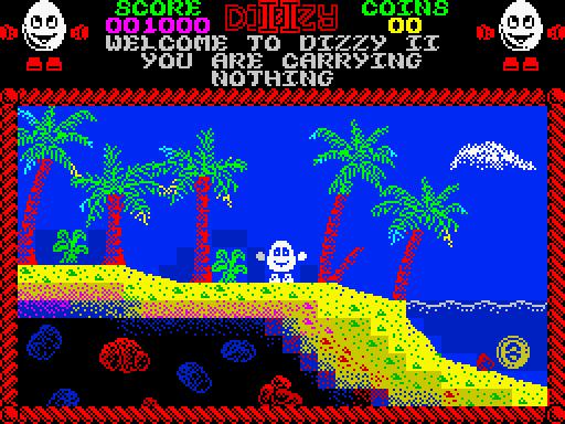
Colour clash has always been a problem - when Dizzy walks in front of red trees, he turns red, and this is a LOT more distracting than him turning grey.Lethargeek wrote: ↑Sat May 14, 2022 12:12 am if you move Dizzy over the "hill" [he] will become grey instead of white, like in the shadows

You could also embrace the gray white as being in shadow, if the screen was properly filled so that would happen in the proper areas.
The stairs like look on the sand, doesn't look nice at all.

Oops! Sorry.Einar Saukas wrote: ↑Sun Oct 09, 2022 2:27 pm Now underwater area (at the bottom right) has bright blue water and non-bright yellow sand in the same square.