Page 2 of 5
Re: SC Retro
Posted: Sat Jul 11, 2020 8:17 am
by Rorthron
[mention]Einar Saukas[/mention] [mention]Nienn Heskil[/mention] These layouts look nice.
Like some others, I hate labelling them "retro". Does it mean the rest of the site isn't retro? Maybe "compact", "condensed", "streamlined", "simplified"...?
Also, perhaps "Creators", rather than "Authors", as discussed previously?
Re: SC Retro
Posted: Sat Jul 11, 2020 9:11 am
by akeley
I'd love a dark theme version of this layout.
Re: SC Retro
Posted: Sat Jul 11, 2020 9:53 am
by hitm4n
I don't think "Lite" is right either, it symbolises "cut-down" for me and i'd believe information was missing.
"SC Compressed"
or
"SC Compact"
maybe
or...
"SC - All the info gathered together in one place around a fire and grooving with a pict"
lol
Re: SC Retro
Posted: Sat Jul 11, 2020 10:01 am
by hitm4n
Hmm, i posted this thinking their was only 1 page of messages.
I see Rorthrons "compact" mention now, think thats the best idea so far.
Also Nienns images, i'm all for shrinking logos and compressing the rest of the layout in favour of more info on screen at once.
V3 looks best as an idea.
I think it would be my default too, i did always like the oldschool site layout on WOS, i don't care about fancy and pretty, its the information we "info"seek.
Re: SC Retro
Posted: Sat Jul 11, 2020 10:07 am
by Pegaz
This looks really good.
I think Rothron made a great suggestion to call this version "compact", which sounds even better than "lite".
Retro is too broad term and I don’t think we should use it in this particular case.
I would go with "compact" any time, but whatever it's called, I really like it.

Re: SC Retro
Posted: Sat Jul 11, 2020 11:25 am
by Juan F. Ramirez
'Lite' or even 'Pocket' sound cool to me.
Re: SC Retro
Posted: Sat Jul 11, 2020 11:43 am
by Alessandro
V3 looks best, maybe because it's the more similar to the old and linear Sinclair Infoseek layout we "grew up" with.
SC Compact or Lite are equally good in my opinion.
Re: SC Retro
Posted: Sat Jul 11, 2020 12:01 pm
by Pegaz
We need a poll !

Re: SC Retro
Posted: Sat Jul 11, 2020 12:30 pm
by XvarZ
Hi.
Overall these are a cleaner presentation of the title. I haven't been able to appreciate the page where you have to click plus signs to open each category.
If you can have all (or mostly all) information on the same page it's easier to read and navigate.
v3 seems to me to be the more balanced one.
(to [mention]Einar Saukas[/mention] and the rest of the SC Team: Thanks!

)
Re: SC Retro
Posted: Sat Jul 11, 2020 12:55 pm
by Juan F. Ramirez
Another vote for V3
Re: SC Retro
Posted: Sat Jul 11, 2020 1:11 pm
by Pobulous
I'm not fussed what it's called - it looks good, though.
v3 for me on the title area.
Re: SC Retro
Posted: Sat Jul 11, 2020 1:52 pm
by druellan
Well, late to the party I love the idea for two or three reasons. First, as Einar, I like how Martijn organized the information, and I disagree that a layout like this can't be responsive, modern CSS has a lot of tools to create responsive tables, so we can have the best of both worlds, and also, I believe that a simple layout is the ideal blueprint to improve how the information is displayed and later transfer those improvements to the main layout.
Re: SC Retro
Posted: Sat Jul 11, 2020 2:56 pm
by druellan
About improvements on the layout, I think that already looks great, but perhaps we can play a bit with the spacing, I like the density of the information, but perhaps a bit of spacing, 4px, could be better for the eyes:

I used this style, be aware that Bootstrap is interfering with table borders:
Code: Select all
<style>
	.container > table {
		border-collapse: separate;
		border-spacing: 0 4px;
	}
	table td {
		padding-left: 8px;
	}
	table td:first-child {
		padding-left: 0px;
	}
</style>
I also created a small table for the author/role, so it has proper columns now.
Re: SC Retro
Posted: Sat Jul 11, 2020 3:07 pm
by Einar Saukas
I also like V3. A more compact header fits better with a more compact page layout.
However we will have to wait for Ricardo to do it. He's the layout expert at SC, and he's giving me support on this new layout too.
Let me take this opportunity to publicly thank Ricardo for all his help, also thanks to Peter for allowing me to mess with his site!
Re: SC Retro
Posted: Sat Jul 11, 2020 3:13 pm
by Einar Saukas
druellan wrote: ↑Sat Jul 11, 2020 2:56 pm
About improvements on the layout, I think that already looks great, but perhaps we can play a bit with the spacing, I like the density of the information, but perhaps a bit of spacing, 4px, could be better for the eyes:
I used this style, be aware that Bootstrap is interfering with table borders:
Code: Select all
<style>
	.container > table {
		border-collapse: separate;
		border-spacing: 0 4px;
	}
	table td {
		padding-left: 8px;
	}
	table td:first-child {
		padding-left: 0px;
	}
</style>
I also created a small table for the author/role, so it has proper columns now.
Looks good! But I know nothing about layout adjusts, you will have to be more specific about what exactly I must change... I sent you a PM
Re: SC Retro
Posted: Sat Jul 11, 2020 3:17 pm
by Einar Saukas
About the name, I really like "compact". It makes more sense than "retro" or "lite".
Or perhaps "pack"? It's a similar idea, but "pack" is a more compact work than "compact".
In the meantime, I implemented magazine references:
https://spectrumcomputing.co.uk/compact/6604
https://spectrumcomputing.co.uk/pack/6604
Re: SC Retro
Posted: Sat Jul 11, 2020 3:39 pm
by Audionautas
Hi
Another vote to version 3, but I love [mention]druellan[/mention] version of playing with spacing for the information to breath and being more easily readable. That's great.
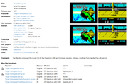
I don't like at all the blank space below the screenshots. Why not including there two more screenshots? or even better why not an RZX video? I think it would give a complete idea of the game in just one look. 1). Text information. What we know about the game? 2). Screenshots. What does the game look like? 3). Video. How it plays?. My idea would be something like this.
Re: SC Retro
Posted: Sat Jul 11, 2020 4:00 pm
by Einar Saukas
Audionautas wrote: ↑Sat Jul 11, 2020 3:39 pmI don't like at all the blank space below the screenshots. Why not including there two more screenshots? or even better why not an RZX video?
The problem is, very few game pages have enough empty space for multiple screens. Most of them look like this:
https://spectrumcomputing.co.uk/pack/6050
https://spectrumcomputing.co.uk/compact/6050
Re: SC Retro
Posted: Sat Jul 11, 2020 4:34 pm
by 8BitAG
Wow, those two views look great. Would be my preferred way of using the site, for sure.
Re: SC Retro
Posted: Sat Jul 11, 2020 5:32 pm
by Pegaz
This is my favorite, for now.
Martjin wos look & fell, greatly preserved.
Compact or Pack, it doesn't matter too much, but I still think compact is the best choice.
Re: SC Retro
Posted: Sat Jul 11, 2020 5:53 pm
by redballoon
This is looking great, Einar! What you'll have to keep in mind are the different screen resolutions, which can make the information almost unreadable.
Reducing the screen width to 991px, for example, or displaying the page on a mobile device shows that the table cell alignment may require some attention. If you press F12 or Right click on the page and select "Inspect" to get into the Developer console you can change then change the screen resolution and select the device you're viewing the page on, you'll see what I mean.
Re: SC Retro
Posted: Sat Jul 11, 2020 6:37 pm
by michellekg
That's really great and I'm voting for this view to become default (so no "retro", "lite" etc), and current view can be something like "modern".
Although I think that you can highlight title of the game and loose "Title" - everybody know what is it. And the page will appear less "crowded".
Maybe something like that:

Re: SC Retro
Posted: Sat Jul 11, 2020 7:39 pm
by hikoki
If I remember right this sentence was useful to make a page responsive.
Code: Select all
<meta name="viewport" content="width=device-width, initial-scale=1">
Add a maximum-scale to disable zooming:
Code: Select all
<meta name="viewport" content="width=device-width, initial-scale=1, maximum-scale=1">
You can customize each page element based on different screen sizes in your CSS file. An example would be:
Code: Select all
html{font-size:100%;}
@media(min-width:60em){html{font-size:100%}}
See the default style and the media based one.
Another example for a SELECT control:
Code: Select all
<meta name="viewport" content="width=device-width, initial-scale=1">
<style>
body {background-color: navy;font-size:16px;}
select {width:100%;font-size:200%;}
@media(min-width:60em){select{width: 100%;font-size:150%;}}
</style>
Take a look at this site to read on media queries:
https://learn-the-web.algonquindesign.c ... a-queries/
A dirty tip to see how media queries are applied is to resize the browser window from large to small, simulating different screen resolutions.
You'd better ask a professional though

Re: SC Retro
Posted: Sun Jul 12, 2020 2:04 am
by Einar Saukas
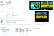
I think we will have to move "creators" to a separate table, because there's too much information. This is a good example:
https://spectrumcomputing.co.uk/compact/1608
In this layout, moving it to a separate table takes almost the same space as keeping it inside the general info. So there's nothing to lose.
Agreed?
Re: SC Retro
Posted: Sun Jul 12, 2020 3:41 am
by Einar Saukas
michellekg wrote: ↑Sat Jul 11, 2020 6:37 pm
Although I think that you can highlight title of the game and loose "Title" - everybody know what is it. And the page will appear less "crowded".
Maybe something like that:
Good idea!