Page 4 of 5
Re: SC Retro
Posted: Wed Jul 15, 2020 1:29 pm
by Einar Saukas
Just to be clear, I'm not looking for a brand. I'm just looking for a proper word to put in the URL.
Perhaps a word that suggests a design that's dense but bright?
https://spectrumcomputing.co.uk/sun/4087
What about a word that implies lightness? It could be:
https://spectrumcomputing.co.uk/helio/4087
Or even:
https://spectrumcomputing.co.uk/zen/4087
I personally like this last option

Re: SC Retro
Posted: Wed Jul 15, 2020 2:00 pm
by 4thRock
How about alternate ?
Seems to describe it well: it's an alternate layout for SC.
Re: SC Retro
Posted: Wed Jul 15, 2020 2:39 pm
by 8BitAG
4thRock wrote: ↑Wed Jul 15, 2020 2:00 pm
How about
alternate ?
Seems to describe it well: it's an alternate layout for SC.
alt
Re: SC Retro
Posted: Wed Jul 15, 2020 2:44 pm
by Einar Saukas
Re: SC Retro
Posted: Wed Jul 15, 2020 4:00 pm
by ZXDunny
You can retire the old ugly version now, this is perfect. And to think that people actually wanted to waste so much space.
Re: SC Retro
Posted: Wed Jul 15, 2020 5:49 pm
by Pegaz
This is the perfect solution!
Now I'm just wondering, how to keep this display as default in every search?
Re: SC Retro
Posted: Sun Jul 19, 2020 2:16 am
by michellekg
Sorry, guys, I'm again with my "let's make title a little more visible and clean" )
How about removing <hr> tag at the top of the page (we don't need it), increase size of title to <font size="+3"> and make top+bottom margin like 10px?
Just add to <table> tag this:
style="margin: 10px 0"
It should look okay:

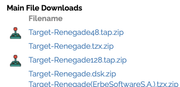
Also I kinda think that you don't need
bold and italic font in all table's headers (for example Main File Downloads). You can make Filename, Release etc only bold, but change color a little bit. For example, to #888888 or maybe #999999.
Re: SC Retro
Posted: Sun Jul 19, 2020 9:02 pm
by Einar Saukas
My apologies for the late replies. I just spent the last few days optimizing the site even further. Everything should work a lot faster now, for both primary and alternate layouts.
We now return to our regular programming...
Re: SC Retro
Posted: Sun Jul 19, 2020 9:04 pm
by Einar Saukas
Pegaz wrote: ↑Wed Jul 15, 2020 5:49 pmNow I'm just wondering, how to keep this display as default in every search?
I'm currently discussing a few ideas with Peter and Ricardo. Perhaps cookies to remember each user's preference? Suggestions are welcome!
Re: SC Retro
Posted: Sun Jul 19, 2020 9:29 pm
by Einar Saukas
michellekg wrote: ↑Sun Jul 19, 2020 2:16 amHow about removing <hr> tag at the top of the page (we don't need it), increase size of title to <font size="+3"> and make top+bottom margin like 10px?
Done, thanks!
michellekg wrote: ↑Sun Jul 19, 2020 2:16 amAlso I kinda think that you don't need
bold and italic font in all table's headers (for example Main File Downloads). You can make Filename, Release etc only bold, but change color a little bit. For example, to #888888 or maybe #999999.
I don't think it works when files are not available for download, for instance:
https://spectrumcomputing.co.uk/alt/2937
But I agree that
bold italic stands out too much. What about
italic underline?
Re: SC Retro
Posted: Sun Jul 19, 2020 9:31 pm
by Pegaz
Einar Saukas wrote: ↑Sun Jul 19, 2020 9:04 pm
Pegaz wrote: ↑Wed Jul 15, 2020 5:49 pmNow I'm just wondering, how to keep this display as default in every search?
I'm currently discussing a few ideas with Peter and Ricardo. Perhaps cookies to remember each user's preference? Suggestions are welcome!
Well, I don't know how best to solve it from a technical point of view, but I would just like to make one small remark regarding this compact version.
I think the size of the games title is now too big, disproportionate to the rest of the page.
The previous size seemed ideal to me, this one now seems inconsistent and unpleasant to watch...
Re: SC Retro
Posted: Sun Jul 19, 2020 9:45 pm
by Einar Saukas
Pegaz wrote: ↑Sun Jul 19, 2020 9:31 pmI think the size of the games title is now too big, disproportionate to the rest of the page.
I don't think the title looks too big now. But it's probably because of the SC logo that's even bigger.
I think you are right. When we reduce the logo size in this version, we will probably need to reduce the title too.
Re: SC Retro
Posted: Sun Jul 19, 2020 10:56 pm
by hikoki
FYI some table elements look like misaligned on Safari 9.
Re: SC Retro
Posted: Mon Jul 20, 2020 3:20 am
by michellekg
Einar Saukas wrote: ↑Sun Jul 19, 2020 9:29 pm
But I agree that
bold italic stands out too much. What about
italic underline?
Yeah, I think that's kinda nice. It's better then my suggestion!
Re: SC Retro
Posted: Mon Jul 20, 2020 7:58 am
by p13z
hikoki wrote: ↑Sun Jul 19, 2020 10:56 pm
FYI some table elements look like misaligned on Safari 9.
Same here on Chrome. The "issue" column for magazines displays one row too high.
Re: SC Retro
Posted: Mon Jul 20, 2020 10:42 am
by ZXDunny
Einar Saukas wrote: ↑Sun Jul 19, 2020 9:29 pm
michellekg wrote: ↑Sun Jul 19, 2020 2:16 amHow about removing <hr> tag at the top of the page (we don't need it), increase size of title to <font size="+3"> and make top+bottom margin like 10px?
Done, thanks!
michellekg wrote: ↑Sun Jul 19, 2020 2:16 amAlso I kinda think that you don't need
bold and italic font in all table's headers (for example Main File Downloads). You can make Filename, Release etc only bold, but change color a little bit. For example, to #888888 or maybe #999999.
I don't think it works when files are not available for download, for instance:
https://spectrumcomputing.co.uk/alt/2937
But I agree that
bold italic stands out too much. What about
italic underline?
That's a no from me. The original was just fine, though I agree that italics are not needed anywhere.
Underline means clickable, and they ain't.
How about a note in the main file downloads that specifies (or links to information) as to why they're not available?
Re: SC Retro
Posted: Tue Jul 21, 2020 6:55 am
by Einar Saukas
p13z wrote: ↑Mon Jul 20, 2020 7:58 am
hikoki wrote: ↑Sun Jul 19, 2020 10:56 pm
FYI some table elements look like misaligned on Safari 9.
Same here on Chrome. The "issue" column for magazines displays one row too high.
I tried both Chrome and Safari in Windows and MacOS, but I could not reproduce this problem.
Perhaps someone with better layout knowledge could please take a look and let me know how to make the proper adjusts?
Re: SC Retro
Posted: Tue Jul 21, 2020 6:58 am
by Einar Saukas
ZXDunny wrote: ↑Mon Jul 20, 2020 10:42 am
That's a no from me. The original was just fine, though I agree that italics are not needed anywhere.
Underline means clickable, and they ain't.
Any other ideas?
ZXDunny wrote: ↑Mon Jul 20, 2020 10:42 am
How about a note in the main file downloads that specifies (or links to information) as to why they're not available?
Yes, I still need to add some copyright notice similar to the main layout. It will also work as an explanation when files are not available.
That's another reason this alternate layout is not "official" (available from homepage) yet...
Re: SC Retro
Posted: Tue Jul 21, 2020 9:58 am
by ZXDunny
Einar Saukas wrote: ↑Tue Jul 21, 2020 6:58 am
ZXDunny wrote: ↑Mon Jul 20, 2020 10:42 am
That's a no from me. The original was just fine, though I agree that italics are not needed anywhere.
Underline means clickable, and they ain't.
Any other ideas?
Keep things consistent. Ditch Italics, as they look terrible everywhere except inside actual text for emphasis. Use the same bold/black text as you currently do (in compact mode) for the additional file downloads. These are headings and they should look the same as all the other headings. No need for other colours, it's plainly obvious from their indentation that they belong to their respective sections.
Other than that, it looks bloody great. No wasted space (except for bugs in the layout such as for this one:
https://spectrumcomputing.co.uk/compact/1196 - "Inspiration for"), space being the one of the two main problems with WoS right now (the other being that it doesn't show all info by default, which your compact view does nicely).
Re: SC Retro
Posted: Tue Jul 21, 2020 10:35 am
by djnzx48
Einar Saukas wrote: ↑Tue Jul 21, 2020 6:55 am
p13z wrote: ↑Mon Jul 20, 2020 7:58 am
Same here on Chrome. The "issue" column for magazines displays one row too high.
I tried both Chrome and Safari in Windows and MacOS, but I could not reproduce this problem.
I have the same issue at smaller display widths. It seems to be caused by a leftover from the main site:
Code: Select all
<span class="visible-xs visible-sm"><br></span>
Re: SC Retro
Posted: Thu Jul 23, 2020 7:55 pm
by Einar Saukas
djnzx48 wrote: ↑Tue Jul 21, 2020 10:35 amI have the same issue at smaller display widths. It seems to be caused by a leftover from the main site:
Code: Select all
<span class="visible-xs visible-sm"><br></span>
Fixed, thank you!!!
Re: SC Retro
Posted: Thu Jul 23, 2020 7:56 pm
by Einar Saukas
Re: SC Retro
Posted: Fri Jul 24, 2020 11:05 pm
by p13z
Einar Saukas wrote: ↑Thu Jul 23, 2020 7:55 pm
Fixed, thank you!!!
Thank you [mention]Einar Saukas[/mention].
Huge appreciation and respect for all of your work and the results of it. No one person did as much good for the Speccy scene since Martijn discovered females - IMO
Re: SC Retro
Posted: Sat Jul 25, 2020 10:30 am
by hitm4n
p13z wrote: ↑Fri Jul 24, 2020 11:05 pm...did as much good for the Speccy scene since Martijn discovered females - IMO...
LOL, goddamn females and their wiley ways...
p.s. what are they ?
Re: SC Retro
Posted: Thu Jul 30, 2020 1:58 am
by Einar Saukas
p13z wrote: ↑Fri Jul 24, 2020 11:05 pm
Thank you @Einar Saukas.
Huge appreciation and respect for all of your work and the results of it. No one person did as much good for the Speccy scene since Martijn discovered females - IMO
Thanks!