rastersoft wrote: ↑Mon Feb 22, 2021 4:09 pm
Hi all:
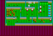
My name is Sergio. I'm from Spain, and I had a 48K Sinclair ZX Spectrum when I was a child. I learned to code in assembly, but never did anything "real", until a month ago, that I decided to try to create a game. My intention is to do a graphical adventure that would work in a 48K model, and this is what I have done so far:
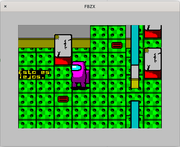
Did you consider using rectangular green floor tiles (either 32x16 or 64x32 pixels) instead of square (32x32 pixels)? I think it will help make it look more 3D.
Einar Saukas wrote: ↑Mon Feb 22, 2021 4:48 pm
This looks fantastic!
Did you consider using rectangular green floor tiles (either 32x16 or 64x32 pixels) instead of square (32x32 pixels)? I think it will help make it look more 3D.
Thanks.
It's an interesting idea... I'll do a test tonight.
Einar Saukas wrote: ↑Mon Feb 22, 2021 4:48 pm
Did you consider using rectangular green floor tiles (either 32x16 or 64x32 pixels) instead of square (32x32 pixels)? I think it will help make it look more 3D.
I tested it, but I didn't like the result. Also tried with 4x3 tiles and the result is also odd-looking.
OK, thanks for trying!
My point was that a square tile suggests you are looking at it from straight up. A rectangular tile would suggest you are seeing it in perspective.
rastersoft wrote: ↑Tue Feb 23, 2021 2:49 pmI still see them more like rectangular tiles, not perspective ones. To be "perspective", they need to be trapezoidal
Sorry, I meant perpendicular pseudo-3D like this or this.
rastersoft wrote: ↑Tue Feb 23, 2021 2:49 pmI also tried changing the circles by ovals, but the effect is still odd.
Perhaps because the tile image itself doesn't look perpendicular pseudo-3D.
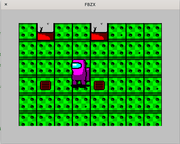
Unfortunately, having different sizes forces to do a lot of changes in the code, and some are not trivial...
What do you think about doing something like this, to keep the tile square but still preserve the illusion of pseudo-3D? Any idea of how to make it better?
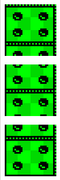
rastersoft wrote: ↑Wed Feb 24, 2021 7:38 pm
Unfortunately, having different sizes forces to do a lot of changes in the code, and some are not trivial...
What do you think about doing something like this, to keep the tile square but still preserve the illusion of pseudo-3D? Any idea of how to make it better?
It will look better if you put shadows only in the lower horizontal border, like this:
And it will look even better to have a wider border so the tile will look slightly rectangular, like this:
Einar Saukas wrote: ↑Wed Feb 24, 2021 9:05 pm
It will look better if you put shadows only in the lower horizontal border, like this:
And it will look even better to have a wider border so the tile will look slightly rectangular, like this:
Unfortunately, those shadows look too much like steps, so finally I decided to just create three different tiles to emulate 4x3 tiles in a 4x4 grid. This way I can have the best of both worlds.