Inverted:
Good graphics with PAPER colour
- Einar Saukas
- Bugaboo
- Posts: 3167
- Joined: Wed Nov 15, 2017 2:48 pm
Re: Good graphics with PAPER colour
Maybe slightly off-topic, but seeing as clebin posted that screenshot of Dan Dare 2, there's something about its graphics I always admired, but I don't think I ever expressed my views to anyone so here goes ... let's see that screenshot again for reference:
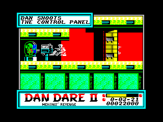
I really like how the background graphics outside the actual play area (I mean the bits where Dan/the enemies can't go) were designed. In some cases they carefully selected ink and paper colours which don't have a high contrast. Certain combinations like yellow/white, green/cyan and red/magenta are very close, so any stippling (that 01010101 pattern) will hardly be visible as pixels and blend nicely instead, especially on the CRT/TV sets most of us used back in the day, resulting in the illusion of a non-standard colour. It all makes for a unusually colourful looking game, and the generally high quality of the graphics doesn't hurt either. There probably are plenty of other cases like this in Speccy games, but I think in Dan Dare 2 they nailed it. Here's the map on Pavero's site if you'd like a closer look.
Re: Good graphics with PAPER colour
That's sort of what I meant but probably didn't phrase well, if you look around the edges there is an element of shadow which makes the outlines darker.
Re: Good graphics with PAPER colour
Some of this inversion could be due to people sketching their sprites first on graph paper (black-on-white) before programming them in and then drawing them colour-on-black instead. I know I was guilty of that as a youngster. Now I tend to sketch on ZX-Art on a PC or, more recently, on a DS-Lite with a sprite utility I wrote to run under ZXDS (Link).
Re: Good graphics with PAPER colour
Ah yes I remember this. Hotpants Harvey vs the Nazis. Great game.
Re: Good graphics with PAPER colour
I always thought Shadow Skimmer was impressive and not just a black background but very colourful, similar to Dandy
Scanner extraordinaire, 1000`s of magazines and Software from the 8 and 16 bit era now up on internet archive in lovely 600dpi.
Donations are welcome of items to scan that are no longer needed