NEW THEME! for the Spectrum Computing Forums

Broken link? Feature request? Anything related to the Spectrum Computing website here.
Post Reply
User avatar
druellan
Dynamite Dan
Posts: 1475
Joined: Tue Apr 03, 2018 7:19 pm

NEW THEME! for the Spectrum Computing Forums

Post by druellan »

Hi! I was picturing the idea of having a custom forum theme for Spectrum Computing for quite some time now, and with the 40th anniversary of the Speccy I've found the perfect excuse to get into it.

Sadly, real life and a big backlog of fixes got in the way ;) , but I finally got the time to finish it. Many, MANY thanks to @PeterJ and @4thRock for the invaluable feedback and suggestions.

Image

Image

The theme is based on the default, so, no big surprises in terms of overall layout, I just worked the styles to find something more in tune with the site. A dark version is also available.

To anyone wanting to take a look, the forum theme can be changed on the user profile on, User Control Panel -> Board preferences -> Edit global settings the option called My board style

Image

Hope you guys like it, any feedback is more than welcome!
User avatar
PeterJ
Site Admin
Posts: 6879
Joined: Thu Nov 09, 2017 7:19 pm
Location: Surrey, UK

Re: NEW THEME! for the Spectrum Computing Forums

Post by PeterJ »

Greetings everyone,

So you we can all experience @druellan's new theme, I have made it the 'default' theme for the 24 hours. The original theme will be set back as the default on Saturday evening.

I'm sure Dario would love some constructive feedback.

When I change things back to normal on Saturday evening, you will be able choose your default theme as described in the original post.

Edited
User avatar
spider
Dynamite Dan
Posts: 1099
Joined: Wed May 01, 2019 10:59 am
Location: Derby, UK
Contact:

Re: NEW THEME! for the Spectrum Computing Forums

Post by spider »

Looks quite good to me.

Its not that dissimilar to the 'we universal' theme I've seen a few years back and that is no bad thing. Note: I'm not saying its based on that!

@PeterJ , I don't actually see the style/theme switch option in my settings, its possible I've overlooked it but its not showing that option.


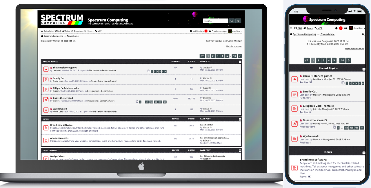
Suggestions: (Desktop view, Firefox v102 only tested)

Main/Global View: The top right search box needs a nbsp after the input box so space it from its "magnifying glass' button and another nbsp or similar between that and the advanced search (possibly same css as posting view)

Forum View: Nicely spaced. Pagination is good. No immediate issues noted.

Topic View: Please add a nbsp; or similar after the 'search this topic' input box on the right so that the 'search' icon has a matching space like the left side. Also a nbsp; is needed after that icon to separate it from the advanced search icon button.

Posting view: That looks OK. It may be worthwhile inserting a <br> or similar after the button row before the post input window as they are sat very close to it. The main buttons underneath the posting view, the spacing is consistent between "save quick draft" and "load quick draft" and "save draft" however it looks like there's two breakspaces between "save draft" and "preview" and between "preview" and "submit" , imo only the spaces should be consistent. :) Personally the slightly larger space between "save draft" and "preview" and "submit" is preferable.


I do like what I see. :) And I have designed themes for other platforms a few years back so I'm aware the time it takes to do this. Much appreciated.

:D

EDIT... 
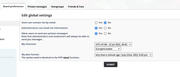
Added quick pic of prefs. Spoilered to not distract from the topic itself:
Spoiler
Image
Also, the font size is sane too. Far too many themes/styles seem to have curiously chosen font sizes usually too small. All OK here!

EDIT2... If I need to clarify any of the above with pics, let me know. No issues to do that. I don't have access to browserstack (a wonderful too to check lots of browsers at once, thankfully I.E is now about dead lol)
Last edited by spider on Fri Jul 22, 2022 8:48 pm, edited 3 times in total.
User avatar
DouglasReynholm
Manic Miner
Posts: 349
Joined: Wed Feb 20, 2019 8:38 pm

Re: NEW THEME! for the Spectrum Computing Forums

Post by DouglasReynholm »

Initially a bit taken aback, but love it, modern and clean. I'll be sticking with this.
User avatar
PeterJ
Site Admin
Posts: 6879
Joined: Thu Nov 09, 2017 7:19 pm
Location: Surrey, UK

Re: NEW THEME! for the Spectrum Computing Forums

Post by PeterJ »

@spider,
I've overridden defaults for the weekend but you will see those options on Saturday evening when I restore the default theme.

Edited
User avatar
Nitrowing
Manic Miner
Posts: 607
Joined: Mon Sep 21, 2020 8:38 pm
Location: Cleethorpes

Re: NEW THEME! for the Spectrum Computing Forums

Post by Nitrowing »

I'm not keen :cry:
Too bright :shock:
User avatar
R-Tape
Site Admin
Posts: 6409
Joined: Thu Nov 09, 2017 11:46 am

Re: NEW THEME! for the Spectrum Computing Forums

Post by R-Tape »

It'll take some acclimatising. I'll give it a day or two before commenting.
User avatar
8BitAG
Dynamite Dan
Posts: 1498
Joined: Sun Dec 17, 2017 9:25 pm
Contact:

Re: NEW THEME! for the Spectrum Computing Forums

Post by 8BitAG »

It's very well done but I cope poorly with sudden changes. Where can I find the option to switch it back?
8-bit Text Adventure Gamer - games - research.
User avatar
PeterJ
Site Admin
Posts: 6879
Joined: Thu Nov 09, 2017 7:19 pm
Location: Surrey, UK

Re: NEW THEME! for the Spectrum Computing Forums

Post by PeterJ »

Hi @8BitAG,

Understood. It's just set for 24 hours.
User avatar
hitm4n
Manic Miner
Posts: 620
Joined: Fri Nov 17, 2017 12:56 pm

Re: NEW THEME! for the Spectrum Computing Forums

Post by hitm4n »

99% good. I don't like the font for the topic titles in the "latest posts" section. It doesn't look "clean" to me. Latest Firefox on Windows 10, no zoom or special stuff going on with browser.

Otherwise, if this was the new default i wouldn't grumble,
I don't have anything cool to put here, so i'll just be off now to see a priest with yeast stuck between his teeth and his friend called Keith who's a hairpiece thief...
User avatar
Jbizzel
Dynamite Dan
Posts: 1537
Joined: Mon May 04, 2020 4:34 pm
Location: Hull
Contact:

Re: NEW THEME! for the Spectrum Computing Forums

Post by Jbizzel »

What the bizzels! I can't handle sudden change at my age :D :D :D :D

Cool though. Now I've come to terms with the idea I haven't been hacked :lol:
User avatar
stupidget
Dynamite Dan
Posts: 1644
Joined: Wed Jan 24, 2018 2:09 pm
Location: Sunny Wolverhampton

Re: NEW THEME! for the Spectrum Computing Forums

Post by stupidget »

I like the new theme, but, and its a big but (fnar fnar), it makes it feel tool....erm.. up to date. I like the fact that a predominately retro forum had a retro 'feel' , but that's just me generally fearing change.

Bring back Texan bars, marathons, cans of Quatro, packs of 10 fags, sierra sapphire cosworths, £1 pints and 45p a litre petrol ( thats how much it was when I started driving in 1991) . I'd love to list loads of things about how great the 80s were, but when I look back, and lot of it was really quite terrible.

Oh and by the way, keep the new theme, it easier on to read on my PalmPilot :D :D
User avatar
Morkin
Bugaboo
Posts: 3277
Joined: Mon Nov 13, 2017 8:50 am
Location: Bristol, UK

Re: NEW THEME! for the Spectrum Computing Forums

Post by Morkin »

Have only had 15 minutes looking at it but it looks good to me. It's great on my mobile. I'll probably have to resize the browser window at work to make it less obvious I'm looking at a Speccy site though.. :lol:

One tiny thing, what happened with the little icons to the left of the thread posts? Most are empty squares, I guess the star means 'unread' (or so it tells me when I hover over it when I'm logged in).

But I saw one which was the fire plus a star (I'm guessing 'hot topic and unread'?) - but when I read the unread post, it just turned to an empty square? Also I normally browse the forum without logging in, I think the icons are different in that case?

(Not a complaint exactly, just a question about what they mean/how they work)
My Speccy site: thirdharmoniser.com
User avatar
druellan
Dynamite Dan
Posts: 1475
Joined: Tue Apr 03, 2018 7:19 pm

Re: NEW THEME! for the Spectrum Computing Forums

Post by druellan »

spider wrote: Fri Jul 22, 2022 8:41 pm Its not that dissimilar to the 'we universal' theme I've seen a few years back and that is no bad thing.
The base layout is exactly the same as the old original. I'm kind of don't want to mess with that, even when PHPBB is feature-complete, can be challenging to maintain. So, only style changes for now.
spider wrote: Fri Jul 22, 2022 8:41 pm Global View: The top right search box needs a nbsp after the input box so space it from its "magnifying glass' button and another nbsp or similar between that and the advanced search (possibly same css as posting view)
Topic View: Please add a nbsp; or similar after the 'search this topic' input box on the right so that the 'search' icon has a matching space like the left side. Also a nbsp; is needed after that icon to separate it from the advanced search icon button.
Noted! The intention of the design is that the search box is "glued" to the buttons, but is not working as well as the original, because of the round buttons and the height of the input box. I'll try to pixel-perfect it so see if improves.
spider wrote: Fri Jul 22, 2022 8:41 pm Posting view: That looks OK. It may be worthwhile inserting a <br> or similar after the button row before the post input window as they are sat very close to it.
Done!
spider wrote: Fri Jul 22, 2022 8:41 pm The main buttons underneath the posting view, the spacing is consistent between "save quick draft" and "load quick draft" and "save draft" however it looks like there's two breakspaces between "save draft" and "preview" and between "preview" and "submit" , imo only the spaces should be consistent. :) Personally the slightly larger space between "save draft" and "preview" and "submit" is preferable.
No idea what is going on there, the spacing is the same for all the buttons, no extra styles or whitesapcing, so, I kind of hard-coded the spacing, but it is not a good practice to patch something you don't understand. Let me know how that works.
I also changed the color of the "preview/submit" pair, I think it looks cool.
spider wrote: Fri Jul 22, 2022 8:41 pm Also, the font size is sane too. Far too many themes/styles seem to have curiously chosen font sizes usually too small. All OK here!
Great! I was worried about that, since these fonts can become too small very quickly, and the original theme has a base font of 10px, that is pretty small.
spider wrote: Fri Jul 22, 2022 8:41 pm EDIT2... If I need to clarify any of the above with pics, let me know. No issues to do that. I don't have access to browserstack (a wonderful too to check lots of browsers at once, thankfully I.E is now about dead lol)
Much appreciated! Let me know how the fixes look, specially the search bar.
User avatar
druellan
Dynamite Dan
Posts: 1475
Joined: Tue Apr 03, 2018 7:19 pm

Re: NEW THEME! for the Spectrum Computing Forums

Post by druellan »

Nitrowing wrote: Fri Jul 22, 2022 8:51 pm I'm not keen :cry:
Too bright :shock:
It is readability problem or just preference? Can a dark version improve things?
User avatar
druellan
Dynamite Dan
Posts: 1475
Joined: Tue Apr 03, 2018 7:19 pm

Re: NEW THEME! for the Spectrum Computing Forums

Post by druellan »

hitm4n wrote: Fri Jul 22, 2022 9:38 pm 99% good. I don't like the font for the topic titles in the "latest posts" section. It doesn't look "clean" to me. Latest Firefox on Windows 10, no zoom or special stuff going on with browser.
I noticed this happening, once on Firefox, but I still don't know what can be causing this, since I didn't use any new fonts, I just re-arrenged the ones already used on the old style.
Can you or anyone affected share a screenshot? Thanks!
User avatar
druellan
Dynamite Dan
Posts: 1475
Joined: Tue Apr 03, 2018 7:19 pm

Re: NEW THEME! for the Spectrum Computing Forums

Post by druellan »

Morkin wrote: Fri Jul 22, 2022 10:57 pm One tiny thing, what happened with the little icons to the left of the thread posts? Most are empty squares, I guess the star means 'unread' (or so it tells me when I hover over it when I'm logged in).
But I saw one which was the fire plus a star (I'm guessing 'hot topic and unread'?) - but when I read the unread post, it just turned to an empty square? Also I normally browse the forum without logging in, I think the icons are different in that case?
To be honest, I just downloaded a pack that looked suitable for the design without paying too much attention :lol:
I think the star means you participated, or you are subscribed to that topic.
User avatar
Ast A. Moore
Rick Dangerous
Posts: 2641
Joined: Mon Nov 13, 2017 3:16 pm

Re: NEW THEME! for the Spectrum Computing Forums

Post by Ast A. Moore »

Ouch. It’s definitely a strain on the eyes and the CPU. The fans whir up on my laptop. (It loads slower, too, maybe because of the background image.)

Not a fan, sorry. :oops:
Every man should plant a tree, build a house, and write a ZX Spectrum game.

Author of A Yankee in Iraq, a 50 fps shoot-’em-up—the first game to utilize the floating bus on the +2A/+3,
and zasm Z80 Assembler syntax highlighter.
User avatar
PeterJ
Site Admin
Posts: 6879
Joined: Thu Nov 09, 2017 7:19 pm
Location: Surrey, UK

Re: NEW THEME! for the Spectrum Computing Forums

Post by PeterJ »

Ast A. Moore wrote: Sat Jul 23, 2022 7:25 am The fans whir up on my laptop.
Is your laptop relatively modern @Ast A. Moore? I recall you mentioned something similar when I added some Christmas decorations. I get fan speed increases when playing modern games and similar intensive applications, but not with websites. It would be useful to know more about your laptop. Thanks
User avatar
Nitrowing
Manic Miner
Posts: 607
Joined: Mon Sep 21, 2020 8:38 pm
Location: Cleethorpes

Re: NEW THEME! for the Spectrum Computing Forums

Post by Nitrowing »

druellan wrote: Sat Jul 23, 2022 2:32 am It is readability problem or just preference? Can a dark version improve things?
Bright white just isn't comfortable
User avatar
Ast A. Moore
Rick Dangerous
Posts: 2641
Joined: Mon Nov 13, 2017 3:16 pm

Re: NEW THEME! for the Spectrum Computing Forums

Post by Ast A. Moore »

PeterJ wrote: Sat Jul 23, 2022 8:21 am Is your laptop relatively modern @Ast A. Moore? I recall you mentioned something similar when I added some Christmas decorations. I get fan speed increases when playing modern games and similar intensive applications, but not with websites. It would be useful to know more about your laptop. Thanks
It’s a mid-2014 MacBook Pro. Was a top-tier laptop back in the day with two GPUs.
Every man should plant a tree, build a house, and write a ZX Spectrum game.

Author of A Yankee in Iraq, a 50 fps shoot-’em-up—the first game to utilize the floating bus on the +2A/+3,
and zasm Z80 Assembler syntax highlighter.
User avatar
PeterJ
Site Admin
Posts: 6879
Joined: Thu Nov 09, 2017 7:19 pm
Location: Surrey, UK

Re: NEW THEME! for the Spectrum Computing Forums

Post by PeterJ »

Thanks @Ast A. Moore,

I know Apple devices last much longer, but in the PC world that's almost prehistoric (that's obviously part of the reason why people use Macs!). Thanks for the feedback.
Stu
Manic Miner
Posts: 243
Joined: Wed May 20, 2020 2:59 pm

Re: NEW THEME! for the Spectrum Computing Forums

Post by Stu »

Only visited on my phone so far but looks good! The topic icons are nice too. One small issue though, some icons have a corner missing — I assume this is where the locked topic icon is meant to be showing?

Image
Lars_74
Drutt
Posts: 5
Joined: Fri Jul 22, 2022 12:35 pm
Location: Germany

Re: NEW THEME! for the Spectrum Computing Forums

Post by Lars_74 »

Hi,
I‘d appreciate it if there was an option to change the board’s colors to a lesser bright version. Maybe a a second option? That white really hurts my eyes. On my iPad I don‘t see any option to change the colors, I guess it is temporarily turned off.
Concerning all the other stuff I cannot really make any comments as I am a new user.

Great forum anyway!
dfzx
Manic Miner
Posts: 683
Joined: Mon Nov 13, 2017 6:55 pm
Location: New Forest, UK
Contact:

Re: NEW THEME! for the Spectrum Computing Forums

Post by dfzx »

Nitrowing wrote: Sat Jul 23, 2022 8:24 am Bright white just isn't comfortable
I agree. I tried the theme when Peter first mentioned it was available, and turned it off again pretty quickly. It's a bit annoying to have it forced on us with no way to turn it off, even if it is for just 24 hours.

It's an extremely high contrast theme with a bright white background. On a large desktop monitor it's uncomfortable to look at for any length of time.

There's a reason blue hues are typically used for backgrounds - the human eye is least sensitive to them. I don't want to knock the work that's gone into this theme, but I'll be glad when I can turn it off.
Derek Fountain, author of the ZX Spectrum C Programmer's Getting Started Guide and various open source games, hardware and other projects, including an IF1 and ZX Microdrive emulator.
Post Reply