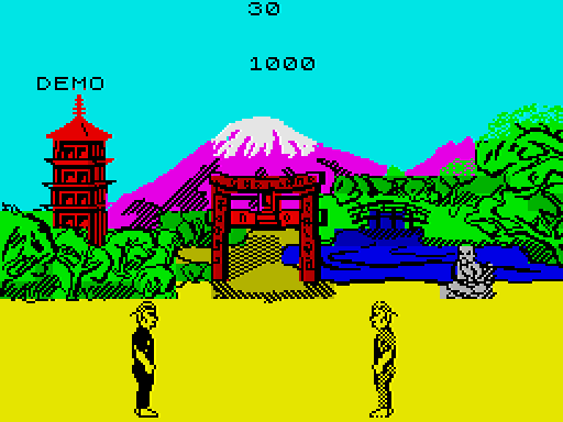
Recently I found myself looking at a screenshot of Way of the Exploding Fist. For the first time in, um, 38 years, I found myself wondering about the graphical layout -- and in particular in relation to the attribute grid. Basically, I wonder why the artist/designer didn't move the fighters down a couple of pixels to avoid their heads by default bleeding into colours on the lower parts of the scenery. Yes, yes, I know when they jump they inevitably enter it but look at this grab from level three (I think):
It seems clear to me that by moving the characters' vertical positions down two or three pixels, they wouldn't suffer perma-green foreheads. There's easily six or seven pixels below their feet, so the space seems to be there.
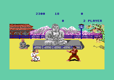
Obviously there is some visual benefit to not having them on the very bottom of the screen but moving them down just a tad would still leave three or four pixels between their feet and the border. The same 'problem' exists on the first screen, but isn't quite so obvious, because it affects only Mr Left:

Sheesh, I really do need to get out more!